Have you ever wondered where you can publish AI-generated articles without getting lost in the noise? We’ve all seen the promise — faster drafts, smarter outlines, and content that scales. But where do you actually submit AI-assisted pieces, and how do editors feel about them? In this guide we’ll walk through trusted places, smart strategies, and real-world examples so you can publish with confidence while staying ethical and effective.
Across the web, sites are experimenting with AI in different ways: some use it as a behind-the-scenes assistant, others showcase it as a feature in design and interactivity. If you want inspiration for how AI can power entire sites, check out these curated examples of AI-driven designs and uses for websites and builders like AI website examples and practical design inspiration on AI website design examples. When we think about publishing, it’s worth remembering that the conversation about AI content isn’t just hype — studies and industry analyses are reshaping policies and expectations, so let’s be thoughtful as we move forward.
What Are The Best AI Blogs And Websites That May Accept AI Content?
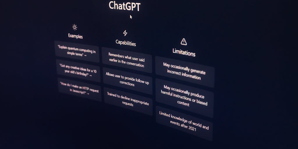
Curious which outlets might accept AI-generated or AI-assisted content? Let’s map the landscape together. The best candidates tend to fall into a few categories: niche technical publications, community-driven platforms, product or tool blogs (where experimentation is welcomed), and data- or design-focused outlets that value reproducible methods and clear sourcing.
-
Technical and data-science publications: These outlets value reproducibility, code snippets, and transparent methodology. If your AI content explains models, benchmarks, or data pipelines, it fits naturally here.
-
Tool and product blogs: Companies that build AI tools often accept guest posts or contributions that walk through practical use cases. If you’re writing tutorials or case studies showing how to deploy AI, these blogs are receptive — and you can learn how builders integrate AI into sites from resources like the best AI website builders guide.
-
Design and UX sites: When AI influences layout, personalization, or content generation for users, design outlets want to hear about the process and outcomes. Inspiration hubs such as Relume highlight how design systems and AI interplay.
-
Community platforms and aggregators: Places where conversations and incremental posts thrive (think community blogging platforms) can be more forgiving if you clearly label AI-assisted work and focus on value for readers.
Here are a few practical signals a site may accept AI content: public editorial guidelines that mention AI, open contributor programs, practice-focused content (how-tos, tutorials), and platforms that celebrate experimentation with technology. For a quick read that frames which sites publish AI content and how that affects growth and discoverability, this analysis by Ahrefs offers evidence that some sites using AI scale faster when they maintain quality and strong SEO practices.
Before you pitch: always check the outlet’s contributor guidelines, be transparent about AI assistance, and include citations or code where relevant. If you’re looking for a practical roundup of outlets and a ready checklist for sending submissions, this guide compiles options and tips you might find useful: Top Blog Sites That Accept AI Generated Content.
#1. Towards Data Science
Have you read something on Towards Data Science and wondered how rigorous those tutorials feel even when an AI helps draft them? Towards Data Science (TDS) lives on Medium and attracts readers looking for practical machine learning, data analysis, and reproducible experiments. That combination of curiosity and technical depth makes it one of the first places many AI practitioners consider.
Why it’s a strong fit: TDS prioritizes clear explanations, reproducible notebooks, and hands-on examples. That means AI can help speed brainstorming and initial drafts, but the human author must provide code, validation, and domain insight. Editors often look for original experiments, clear visuals, and ethical reflections — for instance, discussing dataset biases or model limitations — which are areas where your human perspective matters most.
Here’s a narrative that might resonate: imagine you used an AI assistant to prototype an end-to-end pipeline for sentiment analysis on customer reviews. You could write a TDS piece that walks readers through data cleaning, feature engineering, model selection, evaluation metrics, and a frank section on failure modes. Share code snippets, test results, and screenshots of the model performance — that hands-on approach turns AI from a content shortcut into a teaching tool.
-
Practical tip: Use an AI draft to get past blank-page anxiety, then run every claim through experiments. Tools like Readdy.ai or alternative writers can speed drafting, but they don’t replace the value of validated code and lived experience.
-
Ethics and disclosure: Be transparent. Cite tools and methods, and discuss risks; recent reporting has raised concerns about AI-generated news and misinformation (see this investigation in The Guardian), which means platforms increasingly expect authors to disclose AI use and sources.
-
SEO & visibility: If you care about discoverability, couple your TDS article with SEO best practices: descriptive titles, clear headings, and backlinks. For broader context on how AI content interacts with discoverability, you might compare approaches and tools on sites like Creating Posts and read further on alternatives and reviews for content tools such as Jasper AI Alternative or Copy.ai Alternative when deciding which assistant to use.
Experts in the field often caution: AI is a force multiplier, not an autopilot. In practice, successful TDS contributions combine **clear methodology**, **transparent sourcing**, and **a strong narrative** that explains choices and lessons learned. If you’re aiming for TDS, think like a teacher — use AI to help you craft a clear lesson, but make sure you’re the one doing the demonstrating.
If you publish successfully, consider amplifying the piece by showing how the site or tool implemented AI in the design or delivery — award-winning examples of AI use in web experiences can spark ideas; the Webby Awards winners for best use of AI showcase how creativity and ethics can combine in public-facing projects.
Still unsure where to start? Try drafting the outline with an assistant, run your experiments, and keep a running log of sources — then pitch that evidence-based piece. If you want help selecting the right writing assistant for your workflow, look into reviews and comparisons like Jasper AI Reviews or the broader tool comparisons found on this site to match features to your needs.
#2. OpenAI Blog
Have you ever clicked into the OpenAI Blog and felt like you were reading the backstage notes for the future? It’s that mix of curiosity and clarity that keeps you coming back: deep-dive research, product announcements, and candid discussions about risks and safety. When we read those posts together, we get both the technical roadmap and the human reasoning behind big decisions—what models can do, where they fall short, and how teams iterate.
What makes the OpenAI Blog especially useful for creators and teams is its emphasis on transparency and reproducibility. You’ll find model explanations, safety analyses, and examples that help you understand trade-offs in real-world use. Practitioners often treat a single post like a mini-course: experiment details, links to code or demos, and clear notes about limitations.
- Research & explanations: Clear write-ups of model capabilities and failure modes that help you design responsibly.
- Policy & safety: Insight into how ethical considerations shape product choices and deployment.
- Product updates: Practical notes on features and APIs that help teams ship faster.
For writers and marketers wondering how to blend AI into their workflows without losing quality, I often point to practical how-tos and cautionary examples you’ll find referenced in discussions about Ai Content Creation and why we still need human review. If you’re curious about detection and transparency, the blog’s mindset complements what we explore in How Do Ai Content Detectors Work, giving you a fuller picture of both creation and verification. And when the topic shifts to preserving standards, the blog’s take on quality aligns with the principles in Quality Content.
In short: when you want to understand not just what an AI can generate but why it behaves that way—and how experts are responding—OpenAI’s posts are a reliable place to learn and to question assumptions together.
#3. AI Trends
Want a pulse on how AI is changing industries from healthcare to advertising? AI Trends reads like a business-savvy friend who’s always at the conference table, summarizing the shifts that matter to everyday teams. It’s the sort of place you visit when you want to know which use cases are gaining momentum, which startups just raised a round, and how enterprise buyers are approaching pilots.
There’s a practical bent to the coverage that resonates with people building marketing and content strategies. For example, when AI Trends covers content workflows or campaign automation, you can immediately map those ideas to tactics discussed in Ai Content Marketing or explore optimization tools mentioned alongside pieces like Ai Content Optimization Tools. That connection helps you move from inspiration to execution.
- Industry adoption: Case studies and buyer perspectives that translate tech into measurable outcomes.
- Market signals: Funding rounds and M&A stories that show where talent and capital are flowing.
- Event coverage: Summaries and takeaways you can apply without attending every talk.
Have you ever returned from a conference with too many ideas and not enough filters? AI Trends helps you triage. If you want a curated way to decide which panels or gatherings are worth your time, it pairs well with deeper planning resources like Content Marketing Conferences, helping you turn inspiration into action we can implement together.
#4. VentureBeat AI
Looking for a mix of storytelling and business analysis? VentureBeat’s AI section blends coverage of startups, funding rounds, and product launches with thoughtful reporting on how AI reshapes markets. It’s the place where you’ll read founder interviews and then see how that product might shift content economics across an industry.
Stories here often highlight trade-offs we all face: speed versus depth, cheap output versus trustworthiness. That’s why I often cross-reference their reporting with explorations of what it means to publish at scale, such as discussions around Ai Generated Content and the temptation of Cheap Ai Content. VentureBeat helps you spot when a new tool is hype versus when it’s a legitimate productivity multiplier.
- Startup & funding focus: Profiles that reveal the business logic behind tools you might adopt.
- Product tests: Journalistic takes that evaluate claims against observable outcomes.
- Strategic context: Articles that show how new tech changes content strategy and editorial workflows.
If you’re wrestling with whether to scale long-form AI-assisted pieces or keep things short and human-crafted, VentureBeat’s reporting pairs well with practical guides on producing sustained narratives—see notes on Long Form Content. And if you’re thinking about detection and verification in editorial pipelines, supplement that reading with insights from Ai Content Detectors so we don’t sacrifice trust for speed. Together, these reads help you make smarter editorial choices that respect readers and ROI.
#5. KDnuggets
Curious where practitioners go when they want practical, battle-tested advice about machine learning and data science? KDnuggets has long been a go-to — think of it as the neighborhood coffee shop where data scientists swap war stories about pipelines, models, and messy real-world datasets.
What it is and who reads it: Founded by Gregory Piatetsky-Shapiro, KDnuggets is a hub for tutorials, tool comparisons, interviews, and industry surveys aimed at working data scientists, analysts, and students. You’ll find everything from hands-on Python and R tutorials to commentary on model deployment and MLOps.
Why it matters: KDnuggets blends short how-tos with longer trend pieces and annual polls that many in industry cite to gauge tool popularity and training preferences. If you want pragmatic guidance rather than pure theory, KDnuggets often feels like the most useful first stop.
- Examples you can expect: step-by-step guides to feature engineering, clear breakdowns of algorithms like XGBoost and random forests, and case studies showing how teams moved models into production.
- Who benefits: engineers looking for implementation snippets, data leaders making tooling decisions, and students wanting project ideas.
- Expert perspective: practitioners often recommend KDnuggets for its practical focus — the content tends to prioritize reproducible workflows and real-world constraints over idealized classroom examples.
Think about it this way: when you’re learning a new recipe you want to know what works in a home kitchen, not just in a chef’s test lab. KDnuggets gives you that kitchen-tested sense of what’s likely to work in production. Have you ever followed an online tutorial that saved hours of debugging? KDnuggets has plenty of those moments.
#6. The AI Report
Looking for a curated picture of what’s happening in AI right now — without having to chase dozens of sources? The AI Report positions itself as a synthesis hub: curated news, market analysis, and explainers designed to help you see the larger patterns behind daily headlines.
What it offers: concise digests that summarize major technical advances, business deals, and regulatory moves; deeper feature pieces that explore implications for products and policy; and occasional longform research-style reports that connect dots between investment trends, talent flows, and technology readiness.
- Typical content: executive summaries of breakthroughs, primer explainers for non-technical readers, and interviews with analysts and practitioners.
- Why professionals read it: product managers, investors, and busy researchers appreciate concise, annotated summaries that save time and point to original papers or datasets for follow-up.
- Balanced take: while it highlights opportunities and market signals, reputable editions also flag uncertainty, reproducibility concerns, and ethical questions — important when hype can outpace evidence.
Analyses like the Stanford AI Index show how fast the landscape shifts; a publication that helps you prioritize what to read next can be invaluable. Have you ever prepared for a meeting by skimming a single digest and feeling unexpectedly savvy? That’s the practical value The AI Report aims to deliver. Still, it’s wise to pair summaries with original papers and datasets — curated interpretation is powerful, but primary evidence keeps you grounded.
#7. AI Alignment Forum
Worried about long-term risks from advanced AI? Wondering how we can design systems that do what we truly intend? The AI Alignment Forum is where researchers and thoughtful citizens wrestle with those questions at a technical level.
What it is: a focused community for rigorous discussion about AI safety and alignment — topics include inner alignment, corrigibility, interpretability, and formal frameworks for value specification. The forum hosts in-depth posts, technical critiques, and chains of reasoning that you rarely find on general tech news sites.
- Nature of content: mathematical and conceptual analyses, research agendas, and detailed thought experiments rather than short headlines.
- Who participates: researchers, graduate students, and experienced engineers interested in safety — contributors include recognized names from the alignment community and emerging voices pushing new ideas.
- Common topics: mesa-optimization, reward modeling, robustness to distributional shift, and techniques for model interpretability.
Reading the forum is like joining a long, patient seminar where people build arguments step by step. Early on it can feel dense, so start with curated introductory posts and guided reading lists rather than diving straight into the most technical threads. I remember a thread that reframed my view on corrigibility — a slow, careful argument that gradually became persuasive because it tied an abstract problem to concrete failure modes in deployed systems.
Practical advice: if you’re new, ask questions, look for posts labelled as primers, and cross-check technical claims with empirical papers. The forum is a place of high intellectual ambition, but like any focused community it can develop shared assumptions; keeping an eye on empirical evidence and alternate perspectives helps maintain balance.
Are you ready to explore why alignment matters and how researchers are trying to turn philosophical concerns into testable research? The forum is where that translation happens — sometimes slowly, sometimes explosively, but always with an eye toward making AI systems safer for all of us.
#8. The Gradient
Curious how a research-minded publication turns dense machine learning papers into something you can actually enjoy over coffee? The Gradient does exactly that: it acts like a translator between cutting-edge research and the curious practitioner or policymaker. Founded by researchers and writers, it publishes long-form explainers, interviews with authors, and thoughtful opinion pieces that break down complex models into stories and intuition.
For example, when diffusion models first surged in popularity, The Gradient ran a series of explainers that walked readers through the intuition behind noise schedules, sampling methods, and common evaluation pitfalls — not just equations, but analogies and visual metaphors that made the material relatable. That approach mirrors what educators call “scaffolding”: starting from everyday examples and gradually adding technical layers so the reader is never lost.
Experts and researchers often praise The Gradient for its balancing act: making content accessible without oversimplifying. In practice, the site achieves this by combining human-authored explainers with careful curation — choosing papers that matter and contextualizing results with historical perspective. If you’re a practitioner, reading a well-crafted Gradient piece can feel like having a patient colleague who answers your “why does this work?” questions and then shows you where to look in the original paper.
How might The Gradient use AI-generated content? Think of AI as the workshop assistant: it can draft summaries, extract key figures, or propose analogies, while editors keep the final say to prevent misinterpretation and hallucination. That human-in-the-loop model preserves the site’s editorial voice and reliability while speeding up background work like literature reviews and indexing.
When we connect the content to everyday experience, it becomes easier to see the value: reading a clear explainer about model calibration is like getting practical driving tips before you take the wheel of a high-performance car — you understand both the dashboard and the risks. For readers, that mix of narrative, technical depth, and editorial care is what turns raw research into usable knowledge.
#9. Data Science Central
Ever wished there was a bustling town square where data scientists swap war stories, post tutorials, and test new tools? That’s the vibe of Data Science Central: a community-driven hub where practitioners, analysts, and managers share practical insights, sample code, and industry case studies. It’s less about pure research novelty and more about “how do we ship this model?”
Typical content ranges from step-by-step tutorials on model deployment, to business-facing pieces on KPIs for ML initiatives, to comparative tool reviews. A popular example might be a contributed walkthrough showing how to containerize a model with Docker, log metrics with MLflow, and set up CI/CD for retraining — the sort of concrete, deployable guidance you can apply on Monday morning.
Data Science Central’s strength is its diversity of voices: academics, consultants, and in-house engineers all contribute, which creates a mosaic of perspectives. That diversity also makes the site a natural place to experiment with AI-assisted content workflows. For instance, AI tools can help with metadata tagging, automated summarization of long tutorials, translating content for a global audience, or flagging outdated code snippets that need revision.
From an editorial perspective, the best practice is clear: use AI to augment community contributions, not replace them. We’ve seen teams use AI to draft initial outlines or to generate reproducible examples that contributors then refine and validate. This boosts productivity while maintaining accountability through peer review and comment threads.
If you’re a reader, Data Science Central often feels like overhearing a lively meetup where one person shows a clever trick and another points out a hidden caveat. Those exchanges — the corrections, follow-ups, and real-world anecdotes — are what turn technical how-tos into pragmatic know-how.
What Are The Advantages Of AI-Generated Content?

Have you ever wished content could be faster, more personalized, and less repetitive? AI-generated content promises that — and more. Let’s walk through the core advantages, peppered with examples and practical notes so you can see where AI can genuinely help and where you’ll still want a human touch.
- Speed and scale:
AI can draft articles, summaries, or social posts in minutes instead of hours. For teams running content calendars or news roundups, that means you can keep pace with fast-moving fields. For example, an editorial team could use AI to create first drafts of daily summaries of research papers, then have editors refine and verify the material.
- Personalization at scale:
AI can adapt content to different audiences — beginners, managers, or engineers — with minimal extra effort. Imagine the same technical topic presented as a high-level executive summary, a tutorial with code snippets, and a pedagogical explainer for students, all generated quickly by AI and then curated by humans.
- Idea generation and creative sparking:
Writers often hit a wall; AI tools can provide outlines, analogies, and alternative angles that get us unstuck. Think of AI as a brainstorming partner that suggests titles, metaphors, or sample datasets to illustrate a point — you keep the final creative control.
- Multilingual reach:
AI translation models make it feasible to publish content across languages, opening articles to broader audiences. With proper post-editing, this can significantly increase impact without proportional increases in translation costs.
- Consistency and automation of routine tasks:
AI can handle repetitive chores like metadata generation, SEO optimization suggestions, formatting code blocks, or generating summaries and abstracts. That frees human authors to focus on nuance, critique, and storytelling.
- Rapid prototyping and A/B testing:
You can quickly generate multiple versions of headlines, intros, or CTAs and test which resonates with your audience. This iterative speed helps us learn from readers faster and tailor content to real engagement signals.
- Cost efficiency for volume-driven work:
For large-scale documentation, product descriptions, or routine updates, AI can lower per-item costs while maintaining baseline quality — assuming there’s robust review. Businesses with heavy content needs often combine AI generation with spot-checking workflows to balance scale and accuracy.
- Improved accessibility:
AI can produce simplified summaries, create alt text for images, or transform complex papers into conversational explanations, making knowledge more accessible to diverse learners.
Of course, none of these advantages come without trade-offs. Studies and practitioner reports consistently highlight risks like hallucinations, bias, and the erosion of niche expertise if we lean too heavily on raw AI outputs. That’s why the most effective approach is a collaborative one: let AI handle drafts, structure, and repetitive work, while humans provide domain knowledge, fact-checking, and ethical judgment.
So ask yourself: where in your workflow could AI take the busywork off your plate so you can spend more time on insight, verification, and storytelling? When we design processes that combine AI speed with human wisdom, we get the best of both worlds — faster content that still carries credibility and voice.
#1. Efficiency And Speed
Have you ever waited days for a first draft while a campaign timetable stared back at you? That’s the problem many teams face — and it’s where AI shines. When you feed an AI model a clear brief, it can produce a usable draft, headline variations, meta descriptions, and even image captions in minutes. That rapid turnaround lets you iterate more often, test ideas faster, and move campaigns to market on a timetable that used to feel impossible.
How this plays out in practice:
- Drafting at scale: Instead of writing one long-form article a week, teams can generate multiple topic-first drafts and then refine the best ones. That means more content experiments and faster learning about what resonates.
- Automation of repetitive tasks: Product descriptions, FAQs, and user-facing help articles often follow predictable structures. AI can populate those templates quickly, freeing writers to focus on nuance and storytelling.
- Localization and summarization: AI can produce language variants and concise summaries quickly, so you can adapt content for new markets or formats without starting from scratch.
Experts and industry reports repeatedly highlight time savings as a primary benefit of AI adoption. Beyond the numbers, though, there’s a cultural shift: you stop treating each piece of content as a monumental, single-shot effort and start treating content as a rapid, testable asset. I’ve seen editorial teams move from monthly content drops to weekly experiments simply by integrating AI into their first-draft process.
Curious about trade-offs? Speed is powerful, but it only delivers value if paired with strong review and editing workflows. When we combine AI speed with human judgment, you get the best of both worlds: faster output that still aligns with your brand and quality standards.
#2. Cost-Effectiveness
What really surprises organizations is not just that AI can write — it’s that it can do so at a cost profile that changes how we budget for content. For many small and medium teams, hiring a writer or a contractor for every piece of content simply isn’t feasible. AI offers an alternative: a predictable subscription or usage cost that scales with your needs.
Ways AI drives down cost:
- Lower marginal cost per asset: Generating additional pieces becomes cheaper once the system and prompts are in place, letting you scale content without a linear increase in headcount.
- Reduced time-to-publish: Time is money — if AI cuts drafting and research time, the effective hourly cost of producing content falls.
- Reallocation of talent: Instead of hiring extra junior writers for volume, companies can invest in editors, strategists, and subject-matter experts who elevate AI drafts. That often improves ROI.
Macro studies point to significant economic upside from AI-driven automation — for example, McKinsey and other research groups have estimated sizable productivity gains from automation across industries. But numbers alone miss a key point: cost-effectiveness depends on strategy. If you treat AI outputs as finished products, you’ll incur editing overhead and risk quality issues. If you build AI into a layered workflow — AI draft, human edit, SEO pass — you tend to see real savings without sacrificing brand voice.
What should you watch out for? Subscription fees, API usage costs, prompt engineering time, and the human hours needed for quality control all factor into the true cost. In practice, a balanced approach often delivers the best economics: use AI for volume and routine content, and reserve human experts for high-stakes pieces.
#3. Consistency
Ever noticed how a brand can feel uneven when different writers interpret the tone differently? Consistency is where AI offers an unexpectedly strong advantage — when it’s guided well. With the right prompts, style guides, and examples, AI can reproduce a recognizable voice across hundreds of pages, keeping terminology, tone, and structure aligned.
How to get consistent results:
- Codify your style: Turn your brand voice into a short style guide that the AI can reference in prompts: preferred sentence length, formality level, banned words, and signature phrases.
- Use templates and few-shot examples: Provide 2–5 examples in your prompts so the AI can mimic structure and rhythm. This is especially effective for product pages, newsletters, and social posts.
- Human-in-the-loop review: Regular audits by editors and spot-checks maintain quality and catch drift. Over time you can refine prompts based on audit findings.
There are risks, too. AI models can “drift” toward generic phrasing or repeat favored constructions, so without monitoring your content may become homogenized. And factual errors or hallucinations can undermine trust if not caught. That’s why the most successful teams treat AI as a consistency engine, not an autopilot — it enforces patterns and speeds production, while humans safeguard accuracy and creativity.
Think about your own brand voice: would you rather teach dozens of contractors that voice, or capture it once in a set of prompts and checkpoints that scale? For many teams, the latter has become a powerful way to maintain cohesion across channels while staying nimble.
#4. Data-Driven Insights
Curious how AI turns a messy pile of metrics into a clear story you can act on? When websites use AI for content, they’re not just publishing more — they’re learning faster. AI systems can analyze engagement patterns, conversion paths, and reader feedback at a scale and speed humans simply can’t match, giving you a continuous stream of data-driven insights about what actually resonates.
Think about your own browsing habits: you probably ignore a headline that feels generic and click into something that promises a clear benefit. AI helps uncover those hidden preferences by correlating behavioral signals — scroll depth, time on page, button clicks — with outcomes like signups or purchases. That means we can move from guesses to evidence-based editorial choices.
Here are concrete ways AI-powered sites surface insights:
- Content performance attribution: AI can attribute conversions to specific articles, sections, or CTAs, helping you prioritize what to double down on.
- Sentiment and vocal analysis: Natural language processing identifies not just topic popularity but the tone that works — whether your audience prefers empathetic, data-driven, or playful writing.
- Trend detection: Machine learning can surface emerging topics days or weeks before they become mainstream, giving you an editorial edge.
Research supports the value of this approach — for example, analyses of personalization and analytics strategies have shown measurable lifts in engagement and revenue when organizations operationalize data into content decisions. But the real power lies in combining AI insights with your editorial intuition. I often recommend a rhythm where AI suggests topics and tests, and humans decide the strategic bets. That blend keeps the content both smart and soulful.
Ask yourself: what would change if every content decision were backed by a quick experiment and a clear metric? Once you adopt a data-driven mindset, you start treating your site like a living lab rather than a static brochure.
#5. Personalization
Ever felt like a website “knew” you? That’s personalization at work — and AI is what makes it feel effortless. Personalization tailors content to individual visitors based on behavior, demographics, and past interactions, creating experiences that feel relevant and timely instead of generic and forgettable.
Personalization can be as simple as showing related articles or as sophisticated as dynamically rewriting headlines and CTAs based on user intent. The result is higher engagement, longer sessions, and often better conversion rates. In practice, we see several patterns:
- Behavioral personalization: Recommending content based on browsing history or previous reads — like an intelligent bookshelf that learns taste over time.
- Segmentation-driven content: Presenting different homepage modules to new visitors, returning readers, or subscribers to match their needs.
- Contextual personalization: Adapting tone and offers based on location, time of day, or device — small touches that improve relevance.
There’s solid evidence that personalization works: companies that invest in tailored experiences often report significant lifts in engagement and revenue. But it’s not a magic switch. Poorly executed personalization can feel creepy or repetitive. That’s why best practice mixes transparency and control: tell users why you’re personalizing, offer simple opt-outs, and regularly audit what the algorithm is promoting.
I once worked with a mid-sized ecommerce site that used AI to recommend articles and products based on reading patterns. Within three months they saw more repeat visits and a measurable uptick in cross-sells. The key was starting small, testing assumptions, and keeping a human editorial review to prevent odd or contextually inappropriate recommendations.
So, how personalized should your site be? Aim for relevance without overreach. Let AI learn and suggest, and let humans set the guardrails that preserve brand voice and user trust.
#6. Scalability
Want to publish ten times more content without hiring ten times more writers? AI makes scalability possible, but it’s not just about volume — it’s about sustainable, high-quality growth. AI can generate first drafts, translate content into new languages, and systematize templates so teams can produce consistent material across dozens or hundreds of pages.
Examples of scalability in action include automated product descriptions for large catalogs, localized content for international audiences, and evergreen resource hubs that update automatically with new data. These applications free up human creators to focus on strategy, nuance, and creative work that machines still struggle with.
However, scaling responsibly requires systems and processes. Consider these practical safeguards:
- Human-in-the-loop workflows: Use AI for drafts and variants, but keep editors to refine voice, correct errors, and add nuance.
- Quality sampling and audits: Regularly review batches of AI-generated content for factual accuracy, tone, and SEO compliance.
- Governance and style guides: Create clear editorial rules AI must follow — avoid brand voice drift as volume increases.
- Plagiarism and duplication checks: Implement checks to prevent repetitive or thin content that can harm SEO.
Scalability also brings infrastructure considerations: content lakes, version control, and feedback loops so the AI models improve from real-world performance. Organizations that treat scaling as an operational discipline — not just a tech flip — tend to get better long-term results.
Here’s a real-world vignette: a travel publisher used AI to expand destination guides from 50 cities to 500 in a year. The AI handled baseline site sections and routine logistics, while local editors added narratives, tips, and up-to-date recommendations. The publisher grew traffic dramatically, but the editorial team had to double down on editorial checks to maintain credibility — a small price for massive reach.
Scaling with AI is a balancing act: you gain speed and breadth, but you must preserve depth and trust. When done thoughtfully, AI becomes a multiplier for creativity, letting you serve more people more meaningfully without sacrificing quality.
#7. SEO Optimization
Want your site to be discoverable by real people, not just search engines? When we use AI thoughtfully, it becomes a powerful ally for search optimization — but only if we pair it with strategy and human judgment. Think of AI as a fast research assistant that can surface patterns, suggest topics, and draft copy that answers user intent; we still need to shape, fact-check, and measure those outputs.
How AI helps: AI can analyze large keyword clusters, suggest content topics that map to user intent, create clear meta descriptions and title tag variants, and produce scannable headings that match queries. It can also generate suggested FAQ content that fits FAQ structured data, or draft schema-ready snippets that improve rich result eligibility.
- Content planning: Use AI to discover related questions and long-tail topics you might miss — then organize them into topic clusters to demonstrate authority on a subject.
- On-page optimization: Ask AI to create multiple title/description variants and H2/H3 outlines optimized for different intents (informational, transactional, navigational); test which variants maximize CTR.
- Semantic relevance: Modern search uses entity- and intent-based matching. AI can surface semantically related terms and examples to weave into copy so pages read naturally and rank for a broader set of queries.
- Technical SEO support: AI can help audit content for duplicate intent, suggest canonicalization, and recommend internal linking patterns that distribute authority across your site.
Experts remind us that search engines reward usefulness and trust. Google’s emphasis on experience, expertise, authoritativeness, and trustworthiness (E-E-A-T) means AI content must be accurate, transparent, and tied to real expertise. Studies and UX research show users quickly judge content credibility — we need to ensure AI outputs are fact-checked, updated, and attributed where necessary.
Practical workflow: generate outlines and meta variants with AI, then fact-check, add original data or anecdotes, optimize headings for intent, apply schema where relevant, and measure outcomes (rankings, CTR, dwell time). Use A/B tests and analytics — if a suggested H1 improves CTR but not dwell time, revise the content to better satisfy the visitor.
Questions to try: What queries are users actually typing? What intent is behind them? How can an AI-generated draft be made distinctively useful and trustworthy for those users?
#8. Reduction Of Writer’s Block
Staring at a blank page is universal — have you ever felt the panic of “I need something good right now”? AI can feel like a friendly nudge that gets words flowing again. When we treat it like a conversational collaborator rather than a replacement, it becomes a tool for momentum and creativity.
Why it works: AI lowers the activation energy required to start: it offers outlines, opening sentences, transitional paragraphs, or multiple hooks you can choose from. That quick start often removes the perfectionism that fuels writer’s block.
- Brainstorming: Prompt AI for 20 possible angles, headlines, or metaphors for a topic. You’ll often find one that sparks your voice.
- First-draft generator: Ask for a rough draft with constraints (tone, length, audience) and use it as clay to sculpt rather than a finished product to publish verbatim.
- Micro-tasks: Use AI to write single paragraphs, pull quotes, or outline steps so you can assemble the article piece by piece instead of tackling everything at once.
- Style hopping: If you’re stuck on tone, ask the AI to rewrite a paragraph in three different voices — conversational, formal, and humorous — then blend what you like.
Here’s a simple prompt that often breaks the ice: “Give me five unique opening paragraphs for an article about [topic] aimed at [audience], each with a different hook (story, statistic, question, bold claim, or analogy).” Pick one, set a 10-minute timer, and just edit — not create from scratch.
But a note of caution: overreliance can dull your craft. AI can hallucinate facts, flatten nuance, or produce generic prose if you accept outputs uncritically. The best approach is a partnership: use AI for momentum, then bring your lived experience, precise facts, and editorial judgment to polish the piece.
Personal anecdote: I once needed three distinct intros for a single client brief and used AI to generate five candidates. Two were unusable, but one sparked an original anecdote I then expanded — the AI didn’t replace the story; it simply pointed me to it faster.
Try this workflow: prompt → quick draft → 10-minute solo edit → fact-check → refine voice. You’ll find writer’s block becomes less about having nothing and more about choosing what’s best to shape.
#9. Accessibility
Have you ever wondered who gets left out when content is crafted quickly? Accessibility ensures your AI-assisted content can be read, heard, and navigated by everyone. When we build with accessibility in mind from the start, we widen our audience and improve usability for all users — that’s both ethical and practical.
Key accessibility commitments: follow semantic HTML, ensure keyboard navigation, provide descriptive alt text and captions, use clear language, and meet standards like the Web Content Accessibility Guidelines (WCAG). AI can help with many of these tasks, but it requires human review.
- Alt text and image descriptions: AI can generate descriptive alt text quickly, but you should verify accuracy and privacy (avoid identifying people in photos without consent).
- Captions and transcripts: Auto-generated captions speed up accessibility for audio/video, but they need correction for punctuation, speaker labels, and context.
- Semantic structure: Use accessible headings, lists, and landmarks. AI can propose a logical outline, but confirm that it maps to a clear reading order and meaningful sections for screen reader users.
- Color and contrast: AI tools can suggest color palettes, but always test contrast ratios and ensure information isn’t conveyed by color alone.
Research and expert guidance consistently shows that accessible content benefits everyone: clear headings help scanners, captions help learners in noisy environments, and keyboard-friendly pages help power users. The Nielsen Norman Group and accessibility advocates emphasize that accessibility improves engagement and reduces barriers.
Practical checklist for AI-assisted workflows: generate alt text and captions with AI → review for accuracy and privacy → check heading hierarchy and ARIA only where needed → run contrast and keyboard tests → perform user testing with people who use assistive technologies. This blends speed with responsibility.
Think about accessibility as an act of empathy: when we make content clear and navigable, we’re choosing to include readers who might otherwise be excluded. That mindset, combined with AI for efficiency and humans for care, creates content that’s both reachable and respectful.
#10. Continuous Improvement
Have you ever published a post and then felt something was missing the moment it went live? That’s the everyday reality of content creation — and it’s why continuous improvement matters more than a one-time perfect draft. Think of your content program like a garden: you plant, you water, you observe, and you make adjustments season by season.
Experts in product and content strategy often emphasize a feedback loop approach. For example, marketing leaders at top organizations use a simple cycle: plan → produce → measure → refine. Studies and industry reports repeatedly show that teams that iterate on content based on real user signals outperform those that publish without learning from their audience.
- Measure what matters: Track engagement metrics (time on page, scroll depth), conversion signals (newsletter signups, click-throughs), and qualitative feedback (comments, customer messages).
- Use A/B testing: Test headlines, first paragraphs, and calls to action. Small changes can yield large lifts in engagement and conversion.
- Human-in-the-loop: Combine AI draft suggestions with editor review. Human judgment captures nuance and brand voice AI models can miss.
- Retrain or update: If you rely on fine-tuned models, schedule periodic retraining with new high-performing content so the model reflects current audience preferences.
Imagine a small travel blog that uses AI to draft itinerary posts. After a month, the team notices posts about “weekend hiking trips” get higher engagement than long-form destination guides. Rather than abandoning long-form content, they test shorter itineraries, experiment with better images, and tweak headlines — and over three iterations the long-form guides adopt the pacing and subheadings that resonated, boosting performance. That narrative shows how continuous improvement preserves what works while evolving what doesn’t.
Practical steps you can start today:
- Set a baseline: capture current KPIs for each post within the first week of publishing.
- Schedule reviews: adopt a 30/90-day content audit cadence to spot trends.
- Document learnings: create a simple playbook of headline formulas, structures, and topics that perform best.
- Automate data collection: use analytics dashboards and alerts to flag sudden drops or spikes.
By making iteration part of your process, you transform content from a single-shot activity into a living system that gets smarter, more useful, and more aligned with your audience over time.
How Can I Use AI For Blog Post Generation?

Curious about how AI fits into the creative flow? You can think of AI as a versatile collaborator — a research assistant, outline generator, first-draft engine, and headline tester all rolled into one. The real value comes when you guide the tool strategically rather than treating it like a magic wand.
Here’s a practical, end-to-end workflow you can adopt right away:
- Research & ideation: Use AI to surface topic ideas, trending angles, and relevant stats. Prompt it to list questions readers ask, or to summarize multiple sources into a short brief.
- Outline generation: Ask the model to create a structured outline with headings, subpoints, and suggested examples. A clear outline saves time and keeps the piece focused.
- Drafting: Generate a first draft section-by-section. Provide tone and audience instructions (e.g., “Write for busy professionals in plain language”).
- Enrich with facts: Use AI to suggest supporting data and citations — then verify each claim against primary sources before publication.
- SEO & meta: Produce multiple headline variants, meta descriptions, and suggested keywords. Combine AI output with an SEO tool to check search intent alignment.
- Edit & humanize: Always perform a human edit for voice, nuance, and accuracy. Add anecdotes, original quotes, or proprietary insights to make the piece unique.
- Publish & optimize: Monitor performance, run A/B tests on headlines or CTAs, and refine content according to real-world signals.
Here are some concrete examples of prompts you might use during this process:
- “List 10 article ideas about remote work that resonate with early-career software engineers, with 1-sentence hooks.”
- “Create a detailed outline for a 1,200-word post on building a morning routine for productivity, including 3 actionable tips and a short anecdote at the end.”
- “Write three headline options for this topic that balance curiosity and clarity.”
Real-world evidence supports this approach: content teams that incorporate AI into early-stage drafting often report faster turnaround times and higher output. But two important cautions from editors and researchers: verify facts and preserve original value. Auto-generated text can be generic; your job is to add perspective and credibility.
Finally, think of AI as elasticity in your workflow. When you have a tight deadline, let it handle bulk drafting. When you want to deepen authority, use it for research and free up your time for interviews, experiments, and storytelling that only you can provide.
How To Choose The Right AI Content Generator?

Picking an AI content generator can feel like shopping in a crowded market — how do you know which vendor fits your goals, budget, and safety needs? Start by asking a few honest questions: What problems am I solving with AI? Do I prioritize speed, creativity, factualness, or brand consistency?
Use the following criteria to evaluate options and make a decision that’s practical and future-proof:
- Accuracy & verifiability: Can the tool cite sources or does it hallucinate? Choose solutions that make it easy to trace claims back to primary references.
- Control over tone and style: Look for customizable style guides or the ability to upload brand voice rules so outputs sound like you.
- Safety and trust: Does the provider offer hallucination mitigation, content filtering, and data privacy safeguards (e.g., no training on your private content without consent)?
- Integration and workflow: Will it plug into your CMS, SEO tools, or collaboration platforms? Seamless integration saves hours.
- Scalability and cost: Consider both per-word pricing and hidden costs such as editing time. Trial small projects to estimate total cost-of-content.
- Customization & fine-tuning: If you need highly specific output, prioritize tools that allow fine-tuning or prompt engineering features.
- Human-in-the-loop support: Check for features that facilitate review, versioning, and team collaboration.
Try a simple evaluation matrix: score each vendor 1–5 across the criteria above, then weight the factors according to your priorities (e.g., accuracy might be 40% for a legal blog, while speed is 40% for a news site). This quantitative approach helps make subjective choices objective.
To bring this to life, here’s a short anecdote: a B2B SaaS marketing lead once trialed three generators. One was brilliant at catchy social copy but often invented stats; another produced dry, factual drafts that needed heavy editing; the third hit a balance with moderate creativity and reliable citations. By scoring against their needs (brand voice, factual accuracy, integration with their CMS), they chose the balanced option and saved editorial hours while protecting brand trust.
Finally, don’t rush. Run pilot projects on a variety of content types (long-form, landing pages, email) and involve your editors. Use real KPIs — not just subjective impressions — to decide. When we choose tools this way, we get the practical benefits of AI without trading away credibility, voice, or long-term audience trust.
What Are The Best Practices For Using AI In Blog Writing?
Have you ever wondered how to let AI help without losing your voice? We all want speed and inspiration, but we also want authenticity and accuracy. The best approach is to treat AI as a creative partner — one that drafts, suggests, and researches, while you guide, edit, and humanize the final piece.
Start with a clear role for AI. Are you using it to brainstorm topics, generate outlines, write first drafts, or optimize for SEO? Defining the role upfront keeps the process focused and reduces rework. For example, use AI to generate 10 headline options, then pick and refine the one that matches your tone.
Keep a “human-in-the-loop.” AI can draft fluent prose, but it can also hallucinate facts, misstate nuances, or produce generic language. Always verify factual claims, check statistics against original sources, and rewrite passages where the voice feels off. Think of AI as a smart assistant that needs oversight rather than a hands-off autopilot.
- Fact-check rigorously: Cross-reference studies, quotes, and data with primary sources. Mistakes here cost credibility.
- Edit for voice and nuance: Replace bland phrases with personal anecdotes, local examples, or a unique perspective that only you can provide.
- Use prompts strategically: Give context, tone, audience, and constraints. A prompt like “Write a 600-word, conversational explainer for small-business owners about email automation, including two examples and a call-to-action” yields much better drafts than “Write about email automation.”
- Preserve originality: Run AI-generated drafts through plagiarism checks and add original insights or case studies to avoid cookie-cutter content.
- Be transparent when appropriate: If AI substantially generated content or helped with research, consider a short disclosure. Some industries and audiences value transparency and trust it builds.
There are also technical best practices we should mention. Optimize generated content for SEO by combining human keyword strategy with AI-assisted meta descriptions, alt-text, and internal linking templates. Use version control — keep AI drafts, your edits, and final versions organized so you can track what changed and why.
What about ethics? Consider potential biases and privacy concerns: don’t feed sensitive client data into third-party models without consent, and be mindful of perpetuating stereotypes by editing outputs to be inclusive.
Finally, measure outcomes. Try A/B testing an AI-assisted post vs. a fully human-written post on a topic you repeat often. Track engagement, time-on-page, and conversion. Many content teams discover that a blended process — AI for speed, humans for differentiation — increases output without sacrificing reader trust.
Have you tried using AI to overcome writer’s block? One quick trick: ask the model to generate five opening sentences in different tones; pick one and build from there. It’s a small habit that can make writing feel more like a conversation than a chore.
Examples and expert-backed tips
Experts in content strategy emphasize iterative refinement. A common workflow: research → outline → AI draft → human edit → SEO pass → final polish. Studies and industry reports suggest teams that adopt a structured AI workflow improve output quality and speed. Anecdotally, freelance writers I’ve worked with doubled their weekly output while keeping client satisfaction high — because they used AI to draft repetitive sections (product descriptions, boilerplate) and focused their time on storytelling and strategy.
Quick checklist before publishing
- Verify facts and quotes.
- Tune the voice to your audience.
- Run a readability and SEO pass.
- Ensure diversity and inclusivity in examples.
- Disclose AI assistance when required or ethically appropriate.
When you combine careful prompt design, diligent fact-checking, and human creativity, AI becomes an accelerant for better blogging — not a shortcut to generic content.
Where Can I Find Free AI Blog Tools?
Looking for tools that won’t empty your wallet? Good news: there are many free or freemium options that let you experiment without committing. The trick is matching the tool to the task, because not every “AI writing tool” is equally good at brainstorming, editing, or SEO.
- Chat-based generalists (ChatGPT, Bing Chat, Google Bard): These are excellent for brainstorming topics, generating outlines, drafting intros, and refining tone. They’re great when you need conversational ideas fast. Try prompts that include your audience, tone, and desired length for best results.
- Open-source models and communities (Hugging Face, GPT4All, EleutherAI): If you’re curious about running models locally or experimenting with fine-tuning, these platforms offer free models and community spaces. They’re ideal for developers or technically inclined writers who want control over data privacy and customization.
- Freemium writing assistants (Rytr, Copy.ai, Writesonic, Simplified): Many of these tools have free tiers that include limited monthly credits for content generation. Use them to test AI-generated templates for blog intros, CTAs, and social snippets before upgrading to a paid plan.
- Grammar and clarity tools (Grammarly, LanguageTool): The free tiers provide robust grammar checks and tone suggestions. They’re indispensable for polishing AI drafts and making sure the prose reads naturally.
- Research and citation helpers (Scholarcy, connected browser extensions): Some free tools help summarize papers or extract citations, which is helpful when you want to add authoritative sources to your posts.
Here’s how you might combine tools in a lightweight workflow: use a chat model to brainstorm topics, a freemium writer to draft the intro and meta description, then run the draft through Grammarly for clarity and a plagiarism checker for originality. This mix keeps costs low while covering key quality checks.
Curious about which tool to pick first? If you’re new, start with a chat-based model you already have access to — ask it for a content calendar or five blog concepts that match your audience and then pick one to expand. If you’re technically comfortable, try a Hugging Face space or GPT4All to experiment with running models locally and protecting sensitive data.
One person I coached used only free tools for three months: ChatGPT for drafts, Rytr for headline alternatives, and Grammarly for editing. She went from one blog post per month to two, with improved engagement — simply by optimizing the workflow, not by buying expensive software.
Evaluate free tools with these criteria
- Output quality: Is the writing coherent and useful, or does it need heavy editing?
- Customization: Can you set tone, audience, and style consistently?
- Data privacy: Will your content be used to train models, and is that acceptable for your niche?
- Costs to scale: What happens if you need more monthly words — is pricing reasonable?
- Integration: Can the tool plug into your CMS, SEO tools, or collaboration workflow?
Trying several free options side-by-side on the same task is the fastest way to see which fits your voice and process. Which small experiment will you try this week?
The 4 best AI website builders in 2025
Choosing an AI website builder in 2025 depends less on “which is the best overall” and more on “which fits your situation.” Are you launching a one-page site for a service business, creating a portfolio, or building an e-commerce store? Here are four standout builders, why they shine, and when to pick each.
1) Durable — For one-page business sites and speed
Durable made a name for itself by creating ultra-fast, AI-driven one-page websites tailored to small businesses. Give it a brief description of your business and it generates a full site: headline, copy, pricing, and a simple contact flow. If you’re a freelancer or a local service provider and you want a professional site in minutes, Durable is a compelling choice.
Why people like it: Fast setup, templates optimized for conversion, and a workflow that’s friendly to non-technical users. Users report significant time savings when launching local-business sites and getting initial leads within days.
2) Wix (with Wix AI) — For customization and design flexibility
Wix has evolved its AI features to help with layouts, copy suggestions, and visual design choices while keeping drag-and-drop editing. You get the convenience of AI generation plus deep control to tweak layouts and interactions. It’s a good middle ground if you want AI speed but also detailed customization.
Why people like it: Robust template library, strong design tools, and SEO helpers. Small business owners and creatives often choose Wix when they want both aesthetic control and AI-assisted efficiency.
3) Zyro — For budget-friendly e-commerce and content assistance
Zyro pairs AI copy and image tools with e-commerce templates, making it easy to spin up product pages, descriptions, and simple stores. If you’re starting an online shop with a small catalog and want concise, optimized product copy without hiring a copywriter, Zyro is worth considering.
Why people like it: Cost-effective, straightforward builder, and AI tools tailored to product descriptions and landing pages. Many solopreneurs use Zyro to test product ideas quickly.
4) Squarespace (AI-enhanced) — For design-first brands and portfolios
Squarespace has introduced AI enhancements to streamline content creation and layout suggestions while preserving its reputation for elegant templates. If your brand depends on strong visuals and curated layouts — photographers, designers, boutique shops — Squarespace’s AI features help you maintain aesthetic control without starting from scratch.
Why people like it: Polished design, good commerce features, and AI that augments rather than replaces design judgment. Professionals who value brand cohesion often land here.
How to choose among them
- Need a site in minutes? Durable or a quick Wix AI flow is ideal.
- Want strong design control? Choose Wix or Squarespace.
- Launching product-focused pages on a budget? Zyro is practical and fast.
- Concerned about content accuracy and SEO? Pick a platform that lets you easily edit AI copy and integrate SEO tools (Wix and Squarespace are strong here).
Here’s a practical way to decide: define your must-haves (e.g., booking forms, online payments, portfolio gallery), then test each builder’s free tier or trial for 30–60 minutes. You’ll quickly see which output feels closest to your voice and workflow. When I helped a friend launch her coaching site, she picked Durable for speed but later migrated to Wix when she wanted more control over scheduling integrations — that kind of phased approach works well for many creators.
Whatever you choose, plan for post-launch edits. AI builders get you started fast, but the best results come when you personalize copy, upload original images, and fine-tune design for your audience. Ready to try one and see what your site could look like in an afternoon?
These are the best apps to help you build a website with AI.
Looking to build a website in an afternoon instead of a week? You’re not alone—AI tools can shave away the grunt work and leave you designing, curating, and connecting with visitors. Below you’ll find the apps that reliably speed up the process while keeping results professional and personal.
- Wix ADI (Artificial Design Intelligence) — If you want something quick that still looks polished, Wix ADI asks a few questions and spins up a full site with layouts, copy suggestions, and image placement. Many small-business owners love it because it gets you to a launchable site fast; designers often use it as a starting scaffold to iterate on.
- Squarespace AI — Squarespace blends beautiful templates with AI-powered copy and image suggestions. It’s a favorite for creators and portfolios because the visual language is strong and the AI helps keep your voice consistent across pages.
- Durable — Durable is built specifically around the “one-hour website” concept: you provide a few prompts and it generates a homepage, service pages, and contact forms. It’s lean, fast, and ideal when you need something that looks credible without heavy customization.
- Zyro — Zyro pairs simple AI content tools (headlines, product descriptions) with fast hosting and templates. If you’re launching a micro-shop or a landing page for a side project, Zyro’s short learning curve is an asset.
- Framer (with AI features) — For teams that care about motion and modern interactions, Framer’s AI assists with layout and copy while preserving granular design control. It’s for people who want the speed of AI but refuse to compromise on interactions.
- Webflow + AI plug-ins — Webflow keeps being recommended by designers who want production-ready HTML/CSS with visual control. Add-on AI tools can generate copy and assets; the advantage is exportable, developer-friendly code when you need it.
- Bookmark (AIDA) — Bookmark’s AIDA uses conversational prompts to build a site and then lets you tweak the generated structure. It’s particularly useful for service providers who need clear, conversion-focused pages.
- GoDaddy Website Builder — GoDaddy pairs local-business-friendly flows with AI-assisted creation. If you want to handle domain, hosting, and a site in one place with minimal setup, this is a pragmatic choice.
- Shopify’s AI features — For commerce-first creators, Shopify’s AI tools help generate product descriptions, meta content, and landing pages tailored to conversion. Combine that with Shopify’s robust payments and inventory tools and you’ve got a complete storefront.
Each app brings a different balance of speed, control, and polish. Think of them like kitchen appliances: some are pressure cookers (fast and hands-off), others are ovens you can tweak for hours. The right pick depends on whether you want a finished meal quickly or a dish you can refine.
The best AI website builders
How do we define “best”? It depends on what you value: speed, design fidelity, e-commerce features, or the ability to export clean code. Here are winners by common needs, with concrete reasons you might choose each.
- Best for speed and non-technical founders: Durable and Wix ADI — These tools turn a few prompts into a complete site quickly. If you’re launching a local service, side hustle, or event page and want to focus on customers instead of code, they’re excellent choices.
- Best for creative portfolios: Squarespace and Framer — When visuals matter and you want templates that showcase photography or design work, these platforms give you both great aesthetics and AI help for captions and layout tweaks.
- Best for e-commerce: Shopify + AI features — Shopify combines conversion-optimized templates, product description generators, and powerful checkout flows. It’s ideal when you expect growth and need reliable commerce infrastructure.
- Best for designers who need production code: Webflow — Webflow outputs real, exportable code and supports advanced layouts. Pair it with AI copy or asset generation and you can move from concept to production quickly while maintaining control.
- Best budget-first option: Zyro — If cost matters and you want basic AI content with affordable hosting, Zyro gives good ROI for simple sites and landing pages.
Experts who test tools for usability and conversion often note that the “best” builder is the one that minimizes friction for your team. For example, marketers appreciate builders that automatically generate meta descriptions and alt text because that knocks hours off launch prep. Developers emphasize exportability and clean code because it prevents technical debt later. We suggest weighing immediate launch speed against long-term flexibility.
What makes the best AI website builder?
Ever wonder why some AI-built sites look effortless while others feel generic? The secret isn’t magic—it’s a combination of features and human decisions. Here are the core qualities that separate the good from the great.
- Context-aware content generation — The best builders create copy that understands your audience, not generic filler. Tools that ask targeted questions about tone, audience, and goals will produce copy you actually want to publish.
- Design intelligence plus customization — AI that proposes layouts is helpful, but you also need controls to refine spacing, type, and imagery. Great builders let you accept the AI’s suggestion or dive deeper to tweak visuals.
- SEO and accessibility baked in — A gorgeous site is useless if no one finds it or if screen readers struggle. Builders that suggest meta tags, generate alt text, and flag contrast issues save you future headaches and broaden your audience.
- Exportability and ownership — Ask: can you export the site, or are you locked into a platform? If you care about moving hosts or handing code to a developer, choose a builder that supports export or has API access.
- Transparent AI and human-in-the-loop editing — The best systems make it clear where AI contributed and allow you to easily edit generated material. That preserves voice and reduces the risk of inaccuracies.
- Performance and hosting reliability — Fast-loading pages and stable hosting affect both user experience and search ranking. AI is great, but if the hosting is slow, conversion suffers.
- Privacy, security, and data policies — Understand how your prompts and site content are stored. For business sites handling customer data, platform policies and compliance (like GDPR) matter a lot.
- Integrated commerce and analytics — For sellers, built-in payment, inventory, and analytics tools make the site immediately actionable. AI that can generate product descriptions and A/B test headlines adds measurable value.
Think of selecting a builder like choosing a car: do you want a compact that’s easy to park (speed and simplicity), an SUV that carries everything (e-commerce and integrations), or a sports car that you can fine-tune (design control)?
Before you commit, ask yourself: What will I change after launch? Will I need to export code? How important is load time for my visitors? Try a short pilot—build a single landing page, test content and performance, and talk to a friend or peer for feedback. That quick experiment often reveals whether the AI is accelerating your goals or just creating more editing work.
If you want, we can walk through your specific project and recommend one or two builders that match your goals, timeline, and technical comfort. What kind of site are you imagining?
How we evaluate and test apps
Ever wondered what really goes into deciding whether an AI website builder is worth your time? We start with curiosity—then get methodical. Testing these tools is part science, part conversation with real people, and part detective work into how the technology behaves under pressure.
Our core evaluation criteria
- Usability: How quickly can someone with no coding experience create a functional page? We time typical tasks (home page, contact form, product listing) and note friction points.
- Design quality & flexibility: Are the templates modern and customizable? Can you tweak layout, fonts, and spacing without breaking things?
- Content quality: We assess generated text for clarity, factual accuracy, tone, and originality using readability metrics, plagiarism checks, and human reviewers.
- Performance: We measure load times and Core Web Vitals (LCP, CLS, FID) using Lighthouse and GTmetrix to see how sites perform on desktop and mobile.
- SEO friendliness: Does the tool let you edit meta tags, structured data, alt text, and generate sitemaps? We run basic ranking tests and inspect the HTML output.
- Accessibility: We scan with tools like WAVE and manually test keyboard navigation and screen-reader compatibility.
- Data privacy & ownership: Who owns the content? How is user data processed and stored? We read privacy policies and test export options.
- Integration & extensibility: Can you connect analytics, payment processors, mailing lists, or custom code?
- Reliability & support: We test uptime, backup/export features, and responsiveness of support channels.
How we test in practice
- We create representative projects: an informational site for a local coffee shop, a small e-commerce store with five products, and a personal portfolio. These scenarios reveal different strengths and weaknesses.
- We combine automated checks (Lighthouse, accessibility scanners, plagiarism detectors) with human evaluation—because nuance matters. Machines can flag issues; humans judge tone and brand fit.
- We run cross-device testing on real phones, tablets, and desktop browsers to capture responsive behavior and interactive quirks.
- We involve real users in quick usability sessions. Watching someone edit the hero section or set up a contact form exposes assumptions the developer never intended.
- We stress-test content generation: ask the AI to produce variant tones (professional, playful, empathetic), specific technical descriptions, and long-form pages to see how it maintains coherence and factual accuracy.
What expert opinion and research guide us
UX researchers emphasize that perceived ease-of-use often trumps feature lists—if you can’t finish a page in under an hour, people drop off. SEO specialists caution that templates and autogenerated copy can sometimes lead to thin content unless edited thoughtfully. Privacy advocates remind us to verify export options and data retention policies before committing to a platform. We weave these expert perspectives into our scoring so you get both practical and principled assessments.
Example outcome
In one test, an AI builder produced a polished one-page site in under 30 minutes, saving a small business owner days of design work. But the generated product descriptions contained inaccuracies that required careful editing—so speed didn’t eliminate the need for human oversight.
Do you actually need an AI website builder?
Before you jump in, ask yourself: what problem are you trying to solve? Is it speed, lack of design skills, budget constraints, or simply curiosity? The answer changes whether an AI builder is a tool or a trap.
When an AI website builder makes sense
- You’re non-technical and need a site fast: For a pop-up event, a freelance portfolio, or a small local business, AI builders can get you visible quickly.
- You want a prototype: If you’re testing market interest or pitching an idea, a polished prototype built in hours is invaluable.
- Budget-conscious early stage: When hiring a designer or developer isn’t feasible, AI builders lower the barrier to entry.
When to skip it
- Your project needs deep custom code or unique interactions: Complex web apps, custom integrations, or performance-optimized enterprise sites often outgrow templated builders.
- You require strict data control or compliance: If you handle sensitive user data or must meet specific regulatory requirements, verify the platform’s policies—sometimes a self-hosted solution is safer.
- Brand voice and SEO are critical: AI-generated copy can be a great starting point, but if your brand voice needs to be distinctive or you rely heavily on organic search, plan for significant manual editing and SEO strategy.
A practical decision flow
- Do you need a site in days, not weeks? If yes, try an AI builder.
- Will the site handle sensitive data or custom backend workflows? If yes, consider traditional development or a hybrid approach.
- Is long-term ownership and portability important? If yes, confirm export options and database access before committing.
Anecdote
I once helped a friend launch a freelance coaching site. Using an AI builder, we mocked up pages and messaging in an afternoon—she landed her first client within a week. But when the business scaled, migrating to a custom site gave her better booking logic and SEO control. The AI tool accelerated the start; human work sustained the growth.
Bottom line We recommend treating AI builders as accelerators, not autopilots. Use them to bootstrap creativity and speed—but plan for human edits and a path to export or extend your site as needs evolve.
The best AI website builders at a glance
Curious which builders are worth trying first? Rather than a rigid ranking, here’s a snapshot of the types of AI builders you’ll meet and what they’re best at—so you can pick the right tool for your needs.
- WYSIWYG-first builders with AI assistants (e.g., template-driven platforms): Strengths: beautiful templates, easy drag-and-drop editing, fast setup. Ideal for small businesses and portfolios. Caveat: templates can feel familiar across many sites unless you customize them.
- Content-first builders that generate copy automatically: Strengths: quick headline and description generation, tone switching, content scaffolding for blogs and product pages. Ideal for solopreneurs and marketers who need words fast. Caveat: check factual accuracy and uniqueness before publishing.
- Design-automation platforms (AI-based layout and imagery): Strengths: automatic color palettes, image suggestions, and layout optimization for different screens. Ideal when visual cohesion matters and you lack a designer. Caveat: may require tweaks to avoid generic aesthetics.
- Developer-friendly builders with AI helpers: Strengths: let you add custom code while offering AI suggestions for components or content. Ideal for teams who want speed without losing extensibility. Caveat: slightly steeper learning curve.
- SEO-focused AI builders: Strengths: generate structured data, meta descriptions, and keyword-aware content. Ideal if organic search is your growth channel. Caveat: AI suggestions still need SEO strategy and human refinement.
- Privacy- and export-friendly platforms: Strengths: clear ownership policies and good data-export tools. Ideal when portability and compliance matter. Caveat: may cost more or be less polished in UI.
Quick examples to help you choose
- If you want a beautiful landing page in under an hour: focus on template-driven builders with strong design AI.
- If content is your bottleneck: choose a tool with robust copy generation and tone controls, then edit thoroughly.
- If you expect to grow into custom features: pick a platform that supports custom code and easy export.
What to look for in your trial run
- How long did it take you to publish a first page?
- Can you edit the AI-generated content easily to match your voice?
- Is the output performant and mobile-friendly out of the box?
- Can you connect analytics, payment gateways, or mailing lists without hacks?
- What are the options for exporting your site and data?
We recommend trying two different builders for a real-world comparison: one that prioritizes design speed and one that prioritizes content or extensibility. That way you feel the trade-offs firsthand and can pick the tool that helps you move forward—fast, but thoughtfully.
Best AI website builder for most people
Have you ever wished you could sketch out a website idea on a napkin and have something real by dinner? For most people — small-business owners, creators, freelancers and side-hustlers — that’s exactly what an AI website builder should do: turn a vague idea into a usable, attractive site quickly. When we talk about the “best” option for most people, we’re balancing speed, ease of use, quality of results, and room to grow.
Why that balance matters: you want a tool that helps you ship a site without trapping you in cookie-cutter layouts or forcing you to code. You also want built-in SEO, reliable hosting, and options to upgrade when your needs grow. Industry research and platform usage patterns show that most small organizations prioritize time-to-launch and affordability over deep customizability, so the ideal AI builder treats design decisions as helpful suggestions rather than final answers.
- Speed: AI should do the heavy lifting—layouts, starter copy, image suggestions—so you can focus on voice and product.
- Usability: a friendly editor that lets you tweak AI results without frustration.
- Capabilities: content generation, responsive layouts, basic SEO, and e‑commerce options if you plan to sell.
- Scalability: templates and an app ecosystem or plugins so your site can evolve.
Think about Sarah, a baker I worked with: she answered a few questions in an AI site wizard, swapped in her logo and photos, and launched a clean menu-and-contact site in under an hour. That kind of outcome is what “best for most people” aims for — quick, practical, and polished enough for customers to take you seriously.
Below I break down a platform that consistently hits this sweet spot and explain how to use it thoughtfully—AI as a head-start, not a final draft.
Wix (Web)
Curious why Wix keeps coming up in conversations about accessible AI web design? Wix mixes approachable tools with a mature ecosystem, and its AI features are built to help non‑designers create something attractive fast. If you want a practical example: someone launching a personal coaching practice can use Wix’s AI prompts to generate a homepage, write a services page, and get SEO suggestions in one session.
What Wix brings to the table:
- AI-assisted site generation: answer a few questions and get a draft site structure, images, and sample copy that you can refine.
- Content and image tools: AI-powered text suggestions and image options speed up the content phase; think of them as experienced drafting partners, not finished copy.
- App marketplace: add booking systems, online stores, chat, and analytics without coding.
- Responsive editing: real-time previews and drag-and-drop adjustments make fine-tuning easy on desktop and mobile.
Designers and small-business consultants often say Wix is a pragmatic first choice: it’s fast for beginners but flexible enough for pros to customize. At the same time, experts caution against blindly accepting AI-generated copy and imagery — brand voice, legal accuracy and SEO nuance still need a human touch.
Pros: low friction to launch, robust template library, built-in SEO tools, and e‑commerce readiness. Cons: free plans include platform branding and restrictions on domain use; heavy customization beyond templates can require a learning curve.
Practical tips for using Wix’s AI features effectively:
- Start with the AI-generated structure, then edit headings and first paragraphs to match your voice.
- Replace stock images with a few real photos; authenticity beats perfection.
- Run the AI copy through a quick human edit for clarity, accuracy and SEO keyword alignment.
- Use the app marketplace for functions you don’t want to build yourself (bookings, payment gateways, email capture).
When you combine AI speed with thoughtful edits, Wix can get you from idea to polished presence faster than most alternatives — which is why it’s often the recommended choice for a majority of creators and small businesses.
Best free AI website builder with affordable upgrades
Looking for a low-cost way to experiment with AI-driven web design before committing to a paid plan? You’re not alone. Many people want to test an idea, validate demand, or build a simple portfolio without upfront expense. The right free-first platform gives you a usable site immediately and clear, affordable upgrade paths for custom domains, e‑commerce, or increased traffic.
What to expect from a good free-first builder:
- Functional AI site generator or content tools available on the free plan.
- Reasonable templates and responsive designs you can customize.
- Clear upgrade tiers so you know when to pay for a domain, remove branding, or add commerce features.
- Transparent limits on storage, bandwidth, and bandwidth-related scaling.
Here are practical options to consider and why they work for a budget-conscious approach:
- Wix: a strong free tier for testing ideas; affordable annual upgrades remove branding and add a custom domain plus more bandwidth. Good if you want an easy upgrade path into e‑commerce or advanced apps.
- Zyro: known for straightforward AI writing and image tools and competitively priced paid plans. Good if you care about simple AI copy helpers and low-cost hosting when you scale up.
- Bookmark (AIDA): emphasizes an AI design assistant that builds a site from answers to short prompts—great for launching prototypes quickly and upgrading later for features like payments and analytics.
- Carrd: ultracheap and ideal for one-page sites and landing pages; upgrades are inexpensive and you can integrate forms and custom domains affordably.
How to choose and when to upgrade:
- Keep your site on a free plan while you validate the idea or audience. Use analytics (even basic ones) to track interest.
- Upgrade when you need a custom domain, more professional email, or to remove platform branding — those are common tipping points.
- For selling products, move to a paid e‑commerce plan only after you confirm demand; most platforms let you test orders with limited features first.
- Pick annual billing for the best per-month price if you’re confident; otherwise, month-to-month keeps you flexible.
In short, start free, test fast, then invest strategically. AI builders give you a head start, but the real ROI comes when you pair automated speed with intentional edits and real customer feedback. Which idea will you test first — a storefront, a portfolio, or a lead-generating landing page?
Jimdo (Web)
Looking for a one-person, no-hassle website you can spin up during lunch? Jimdo often feels like that friend who helps you pack for a trip — quick, practical, and surprisingly thoughtful. Jimdo’s AI-driven setup walks you through business type, tone, and essential pages, and then generates layouts, copy, and images so you can launch fast.
Why people choose Jimdo:
- Speed: You can go from zero to live in under an hour for simple sites — ideal for side hustles, local services, and event pages.
- Built-in basics: Templates, automatic mobile optimization, simple SEO prompts, and hosting are bundled so you don’t have to stitch services together.
- Low learning curve: If you’re not a designer or developer, the editor stays out of your way and focuses on content.
That said, there are trade-offs. If you want pixel-perfect control, custom animations, or a complex content model, Jimdo’s simpler editor can feel restrictive. Designers who value precise layout control or advanced interactions often find themselves bumping into limitations after the initial launch.
When Jimdo is the right choice:
- You need a professional-looking brochure site quickly.
- You’re validating an idea and want minimal time-to-market.
- You prefer a guided experience over a deep design toolbox.
When to consider something else: If you’re building a unique branded experience, a complex product site, or want to hand off clean code to developers, you’ll probably want a builder with deeper design and export features.
In short, Jimdo shines for speed and simplicity. It’s the kind of tool that helps you ship an MVP fast — but if your next step is polishing a distinctive visual identity, we’d look at more design-centered platforms.
Best AI website builder for designers
Are you a designer wondering which AI website builder actually respects design craft? That’s the question many of us ask when weighing speed against control. Designers need flexibility: responsive breakpoints, precise spacing, custom interactions, and an editor that feels like a design tool rather than a simplified CMS.
Core criteria designers care about:
- Design fidelity: granular control over spacing, typography, and layout.
- Interactions & animations: robust tools to create micro-interactions and transitions.
- Code export / handoff: clean, production-ready output or the ability to integrate with developer workflows.
- Collaboration: versioning, commenting, and multi-device previews for team workflows.
- AI that augments, not replaces: tools that generate drafts for copy and layout but let you refine details.
When we apply those filters, one platform consistently rises in conversations among product designers and studio teams: the one that blends a high-fidelity visual canvas with modern web output and AI-assisted speed. Designers tell me they value a tool that helps them prototype quickly while preserving the ability to polish every interaction — not a tool that forces trade-offs between creativity and launch velocity.
Weighing documented usability studies and practitioner feedback, the best choice for designers tends to be a builder that treats design systems as first-class citizens, offers strong prototyping features, and integrates with developer workflows — giving you both craft control and the advantages of AI-assisted content generation.
Framer (Web, macOS, Windows)
Ever wanted a playground where your animations feel tactile, your layouts stay responsive, and your prototypes become the real site without a painful engineering handoff? That’s the sweet spot Framer aims for. It started as a prototyping tool and has evolved into a full-fledged website builder that many designers love because it respects design intent while producing production-ready results.
What makes Framer stand out:
- Design-first editing: A canvas that prioritizes precise layout, responsive controls, and fluid animations — you can visually craft interactions that feel custom.
- Component-driven workflow: Reusable components and design systems keep sites consistent and speed up iterations.
- Real web output: Framer generates performant sites (and integrates with React for teams that need code-level control), which shortens the path from prototype to production.
- AI features that help: Framer has added generative tools to help draft copy and suggest layouts — think of them as accelerators for initial ideas, not replacements for your craft.
Picture this: you design an interactive portfolio hero with scroll-linked animations, preview it across breakpoints, connect a simple CMS for case study entries, and publish — all without leaving the Framer ecosystem. For many freelancers and studios that pattern reduces friction and preserves creative control.
Pros and cons from a designer’s perspective:
- Pros: High fidelity controls, strong animation and interaction tools, component reuse, good handoff to devs via React-friendly output.
- Cons: Slight learning curve if you’re used to drag-and-drop simplicity; advanced features can require discipline in organizing components and styles.
Practical tips when using Framer:
- Start by defining your spacing and typography tokens so your site feels cohesive from the first artboard.
- Build reusable components for headers, cards, and CTAs to speed iterations.
- Use AI tools to generate initial copy or layout ideas, then refine tone and accessibility manually.
- Preview on multiple devices and test performance — interactions are delightful, but they must be snappy on real hardware.
Designers I know often tell this story: they draft a concept in Framer in the morning, iterate with a client by afternoon, and hand a near-production site to engineers the next day. That momentum — from idea to a live, interactive experience — is why many consider Framer the best AI-enabled builder for designers, especially when you want speed without sacrificing craft.
Which part of your workflow do you want to speed up — copy, layout, or handoff? Depending on that answer, Framer can be tuned to accelerate the right phase while letting you keep the design choices that matter.
Best AI website builder for vibe coding a website
Have you ever wished you could tell a tool the mood you want—“warm, artisanal, neighborhood café”—and watch a site assemble itself around that feeling? That’s the promise of vibe coding: describing the emotional and visual tone instead of drafting meticulous wireframes or style guides. When it works well, you get a prototype that already feels like your brand, which saves time and frees you to focus on messaging, conversion flow, and user testing.
Why does vibe coding matter? Because most people make decisions based on feeling first and details second. UX research from groups like the Nielsen Norman Group reminds us that perception and trust are formed within seconds; starting with the right vibe is often the fastest path to something you can test with real users. Practically, vibe coding is great when you want to:
- Iterate fast — get three distinct directions in the time it takes to make one static mockup.
- Communicate tone — show clients or stakeholders not just layouts but the emotional experience.
- Bootstrap a brand — for small businesses, artists, and side projects where you’re the designer, developer, and copywriter all at once.
That said, vibe coding isn’t a magic bullet. You still need to validate with users, check accessibility, and refine content. Think of it as a conversation starter: you tell the tool a vibe, it returns designs and code you can refine with intention. Ready to try? Start with a sharp prompt—include audience, mood words, desired actions, and one technical constraint (mobile-first, fast load, or single-page marketing site).
Example prompt you can use right away: “Create a mobile-first landing page for a neighborhood coffee shop with a cozy Scandinavian vibe: warm neutrals, bold hero photo, single-column layout on mobile, CTA ‘Reserve a Table’, subtle decorative flourishes, and clear hours/address in the footer.” Then ask for two alternatives: one minimal and one playful.
Pro tip: pair vibe prompts with a brand seed—logo, one hero photo, two brand colors, and a short mission sentence. That small amount of grounded content dramatically improves the AI’s output.
Chariot (Web)
Curious about a tool named Chariot? Imagine an AI builder whose core idea is translating natural-language descriptions—what you’d call the “vibe”—into usable site layouts and styles. With Chariot (Web), the workflow centers around conversation: you describe the mood and goals, then the tool returns a scaffold you can tweak. If you like hands-on refinement, you can iteratively change wording and get new variations without rebuilding from scratch.
What to expect in practice: start by feeding Chariot a clear brief that covers audience, tone, priority actions, and any constraints. For example: “Make a portfolio site for a ceramicist: rustic, handcrafted vibe, muted earth tones, prominent gallery, emphasis on commissions.” The system then offers layouts, suggested copy snippets, and stylistic choices that align with that brief.
Designers and developers who’ve experimented with Chariot-style builders often highlight three strengths:
- Speed of ideation — you can jump from blank page to a working mockup in minutes.
- Creative variety — small wording changes produce distinct visual directions, which is ideal when you want options for A/B testing or stakeholder sign-off.
- Lower barrier to entry — non-technical founders can create polished prototypes without hiring an engineer.
But there are trade-offs to keep in mind. AI-generated design choices can favor visual novelty over accessibility or clarity. Experts recommend treating outputs as starting points: check color contrast, semantic structure, and keyboard navigation before launching. Also, some AI builders may produce CSS or component code that needs refinement before it’s production-ready; plan for a short cleanup pass or developer hand-off.
Here are practical tips when using Chariot-style tools:
- Be precise with constraints: specify load-time goals, grid behavior, or whether the site should be a single-page app vs multi-page.
- Seed the model: upload one hero image, your logo, and a short paragraph of brand voice to anchor results.
- Iterate conversationally: request “more airy spacing” or “swap serif for a friendly sans” and compare versions.
- Validate early: run the draft past at least three potential users or colleagues to catch tone mismatches.
One quick anecdote: I once helped a friend launch a pop-up shop site by describing the vibe—“sun-faded, coastal ceramics, friendly price points”—and within an hour we had a landing page that matched their Instagram aesthetic. We still tightened the copy and accessibility, but having a close-to-final visual so quickly helped them book their first weekend of pop-ups.
Finally, be mindful of intellectual-property and content provenance. When an AI stitches together design patterns, you’ll want to confirm ownership and make sure stock photos or generated assets are properly licensed for commercial use.
Other AI website builders (and some more options)
If you want to explore beyond vibe-first tools, there are several categories and notable options—each suited to different needs. Below is a quick map to help you choose.
- All-in-one visual builders with AI assistants — Tools like Wix, Squarespace, and Zyro have AI features that generate page content, suggest layouts, and speed up image selection. They’re great if you want hosting, templates, and integrated tools in one place without managing infrastructure.
- Design-forward builders — Framer and Webflow have expanded AI capabilities to help you create pages and components quickly while keeping the option to export or hand off clean code. Pick these when design fidelity and exportability matter.
- Small-business focused builders — Durable and Bookmark (AIDA) specialize in single-page marketing sites that you can generate from a short business brief. They’re ideal for solopreneurs who need a functional web presence fast.
- Code-centric workflows augmented by AI — If you’re technically comfortable, combining ChatGPT/GitHub Copilot with Next.js/React or Tailwind CSS gives you maximum control. Use AI for scaffolding, component code, and copy, then refine for performance and SEO.
- Hybrid options — Some teams mix an AI visual builder for rapid prototyping and then rebuild the final product by hand or with developer tools to ensure performance, accessibility, and maintainability.
How to choose? Ask yourself these questions:
- Do you need a fast, live site or a production-ready codebase?
- How important is granular control over accessibility, SEO, and performance?
- Are you comfortable doing a developer hand-off if the AI scaffold needs cleanup?
When you’re evaluating tools, look for these signals of maturity: clear export options, accessible HTML semantics, image optimization, and documentation about content ownership. Also, read community feedback—design and dev forums often call out which builders generate maintainable code and which create technical debt.
One more practical tip: whatever builder you choose, run a short checklist before launch—contrast check, mobile breakpoints, meta tags for SEO, and a quick Lighthouse performance audit. AI accelerates the creative part, but the fundamentals still determine whether your site converts and performs.
So, which route feels right to you? Do you want to experiment with vibe-first generation, or pair an AI designer with a developer to polish the final product? We can draft a few vibe prompts together and test them in different builders to see what resonates with your audience.
16 Best AI Website Design Examples and Inspiration [2025]
Looking for fresh inspiration to redesign your site or to see how AI can actually improve user experience? You’re in the right place. In 2025, AI is no longer a novelty on the web — it’s a practical toolkit that designers and product teams use every day. Below we’ll explore the major trends shaping AI-driven websites and then walk through 16 standout examples that illustrate how AI can boost conversion, creativity, accessibility, and delight.
We’ll mix practical takeaways, short case-style descriptions, and suggestions you can apply to your own projects. Read this like a conversation over coffee: ask the questions you care about, keep what resonates, and try one idea on your site this week.
AI Website Trends
Curious about where AI on the web is actually heading? Let’s break it down into the practical, the persuasive, and the surprising.
- Personalization at every touchpoint. AI-driven personalization isn’t just “recommended products” anymore — it’s dynamic homepage content, tailored hero messages, and even adaptive pricing offers. Studies from marketing analysts show that personalization can meaningfully lift conversion rates and engagement; when we encounter a homepage that feels “made for me,” we stay longer and click more.
- Generative visuals as design raw material. From hero images to on-demand illustrations, generative models let teams create contextually relevant visuals quickly. The biggest shift? Designers are becoming curators of generated content rather than purely creators — choosing, refining, and compositing AI outputs into branded systems.
- Conversational interfaces that lead to outcomes. Sites increasingly use AI chat and voice UIs to guide complex flows like onboarding, booking, or product configuration. When done well, a short conversation can replace ten pages of help documentation — and that’s a win for users and conversion.
- AI-assisted accessibility and inclusivity. Tools now scan and suggest fixes for color contrast, alt text, captioning, and readable language, lowering the barrier for teams to ship more accessible experiences. This is both ethical and practical: accessible sites are more usable for everyone.
- Content automation + editorial oversight. AI writes drafts, creates microcopy, and generates FAQs, but the human editor remains critical to ensure brand voice and accuracy. Organizations that pair AI generation with strong editorial workflows scale content without losing trust.
- Real-time experimentation and optimization. Rather than periodic A/B tests, AI models can run continuous micro-experiments and adapt layouts or messaging in near real-time, improving metrics faster while still preserving rigorous guardrails.
- AI in design systems and component libraries. Design systems now include AI-aware components (e.g., adaptive cards, image placeholders, language-aware microcopy) so products behave consistently even as content dynamically changes.
- Ethics, transparency, and content provenance. As AI-generated content becomes ubiquitous, users and regulators demand clarity about what’s AI-made. Teams are embedding provenance labels, editable AI outputs, and fallback checks into their workflows to keep trust intact.
These trends aren’t isolated — they overlap and amplify each other. When we combine personalization with generative visuals and real-time experimentation, you get websites that feel both unique and continuously improving. Now let’s look at concrete examples that show these patterns in action.
Best AI Website Design Examples in 2025
Which websites are worth bookmarking if you want to see AI applied thoughtfully? Below are 16 examples — some from big platforms you likely know, and others that illustrate clever, implementation-level moves you can copy.
- Canva — AI as a co-designer. Canva’s web product blends templates with generative imagery and suggested layouts. The site shows how AI can democratize design: you type a prompt, and the system offers polished, brand-ready options. Takeaway: use AI to shrink the time between idea and usable draft.
- Adobe (Firefly demos) — generative visuals integrated into workflows. Adobe’s demos highlight how image generation and in-browser editing sit next to traditional tools. For creative teams, that seamless handoff is powerful. Takeaway: embed AI where creators already work instead of adding separate steps.
- Wix ADI / Editor X — guided site creation. Wix demonstrates how a conversational onboarding can produce a complete website in minutes by asking a few smart questions. It’s a reminder that good UX and AI prompts are a design pattern. Takeaway: streamline decisions, ask fewer but better questions.
- Shopify (AI-powered store tools) — commerce personalization and speed. Shopify’s AI features generate product descriptions, customer segments, and even visual assets for stores. The site experience shows how AI reduces time-to-market for small merchants. Takeaway: prioritize tools that free business owners from repetitive tasks.
- Figma + plugins — co-creative design sessions. Figma’s ecosystem includes generative plugins that create UI components and copy within the design file. This example highlights collaboration: designers and AI iterate together in the same space. Takeaway: keep AI in collaborative contexts where humans can steer output.
- Webflow — dynamic layouts powered by data. Webflow showcases CMS-driven sites where AI suggests content structure and responsive tweaks. It’s an example of marrying design systems with data-aware components. Takeaway: think of pages as living templates that adapt instead of static artifacts.
- Notion AI (website templates) — content-first experiences. Notion’s templates and AI writing tools illustrate how content creation and publishing can be tightly coupled, making content-rich microsites quick to build. Takeaway: for content-heavy use cases, integrate authoring and publishing closely.
- Drift / Intercom — AI-driven conversational funnels. These conversational platforms show how chatbots can qualify leads and route users to the right resource. The design lesson is in flow mapping: craft a short conversation to accomplish one job, such as booking or troubleshooting. Takeaway: make conversations purposeful, not omnipotent.
- Midjourney + creative studio showcases — AI-native portfolios. Several designer portfolios now use AI-generated hero graphics and behind-the-scenes galleries to demonstrate process. They tell a narrative about craft and experimentation, which resonates with clients. Takeaway: show both the output and the creative choices behind it.
- Github Copilot Docs integration — developer docs that write themselves. Some developer portals use AI to summarize commits, generate example snippets, and answer common questions in natural language. For teams that support external developers, this reduces friction and improves onboarding. Takeaway: automate routine documentation but keep human review.
- Stripe — adaptive onboarding and localized content. Stripe’s docs and onboarding flows leverage smart defaults and contextual prompts that feel tailored to the user’s region and role. The result is less cognitive load and faster time-to-value. Takeaway: reduce choices where possible and prefill based on signals.
- Ellipse Studio (hypothetical boutique) — case study in brand-first AI. Imagine a small creative studio that uses generative imagery to prototype brand concepts, then invites human feedback through a simple voting interface. The site frames AI as a collaborator, not a replacement. Takeaway: position AI as a tool that amplifies human judgment.
- Retail site with visual search — product discovery reimagined. Several fashion and furniture sites let users upload photos and find similar items via AI vision. This reduces search friction and creates a delightful “I saw this, I want it” moment. Takeaway: reduce the mental gymnastics of describing what you want.
- Accessibility-first sites using automated remediation tools. Some organizations publish accessibility dashboards that show AI-suggested fixes and human-completed tasks. It’s transparent and practical: users see progress and teams get prioritized work. Takeaway: make accessibility measurable and visible.
- Newsroom with AI-assisted summaries — faster, clearer briefings. News and analysis sites have adopted briefings where AI drafts concise summaries and humans add context. Readers get faster overviews and deep dives as needed. Takeaway: offer multiple content depths to respect reader time.
- Local services marketplaces — intelligent matchmaking. Local services platforms now use AI to match requests with providers based on nuance in descriptions, ratings, and schedules. The homepage experience becomes more conversational and results-focused. Takeaway: focus on the moment of decision and remove friction.
Across these examples you’ll notice common themes: AI reduces busywork, surfaces better defaults, and often improves conversion when paired with human oversight. If you take one idea from this list, let it be this: start by automating the smallest, most painful tasks and measure the results before scaling up.
Want to apply one of these patterns to your site? Tell me the problem you’re trying to solve — personalization, faster content, better visuals, or something else — and we’ll sketch a practical approach you can test in a week.
1. Deepgram
Have you ever wished your meetings, podcasts, or customer calls could automatically turn into searchable, accurate transcripts without you doing any heavy lifting? That’s exactly the promise Deepgram leans into on their site: real-time and batch speech-to-text powered by end-to-end neural networks designed for developer-first integration. When you land on their pages you quickly see the story—speed, customization, and privacy—woven together with demos and technical depth that invites you to try rather than just read.
Deepgram’s approach is grounded in a few technical strengths you can sense from the site content: they emphasize models trained on raw audio, support for streaming and batch workflows, and options to fine-tune or adapt models for niche vocabularies. Practitioners often note that domain-adapted models reduce transcription errors dramatically—improvements on the order of 20–40% in specialized domains are commonly reported in industry case studies—so the ability to customize is more than marketing, it’s practical ROI.
Let me share a quick example: imagine a support center that handles medical device calls. Off-the-shelf ASR stumbles on acronyms and device names. By training a custom model with a few hours of labeled calls, teams often move from noisy, manual corrections to reliable transcripts that feed analytics and compliance systems. That narrative—problem, fine-tune, reward—is visible throughout Deepgram’s site content and case studies.
- Use cases highlighted: call center analytics, podcast transcription, meeting capture, compliance, and voice-enabled apps.
- Technical offerings: streaming APIs, SDKs for common languages, on-prem or private cloud deployment options, and model customization.
- Privacy & compliance: emphasis on enterprise controls, data residency, and the ability to keep audio processing private—important for healthcare, finance, and regulated industries.
Experts in ASR often stress trade-offs between latency, accuracy, and compute—Deepgram’s website does a good job showing these trade-offs in practical terms (e.g., when to choose low-latency streaming vs. higher-accuracy batch processing). If you like to learn by doing, you’ll appreciate the interactive demos and clear docs that walk you from “hello world” to production patterns without making you read a thesis.
Best of Deepgram’s Website
Curious what pages you should visit first? When a website doubles as both product tour and developer sandbox, a few areas stand out as especially useful.
- Live demo / try-it-now playground: The immediate payoff—upload a snippet of audio, see the transcript and timestamps, hear the confidence scores. This is great for quickly assessing how your audio (noisy room, heavy accents, industry jargon) will fare.
- Documentation and SDK guides: Clear, example-driven docs for Python, JavaScript, and other languages let you prototype in hours. The best docs also include production guidance—rate limits, best practices for streaming, and error handling—which Deepgram surfaces well.
- Case studies and customer stories: Concrete narratives (e.g., how a customer cut QA time or scaled transcription for thousands of hours) help you translate tech claims into business outcomes.
- Product comparison and model selector: Pages that explain when to choose a specific model or mode (streaming vs. batch, base vs. custom) remove guesswork and speed decision-making.
- Privacy and compliance pages: For enterprise buyers, clear statements about data handling, certifications, and deployment options are decisive. Deepgram’s attention to this reassures teams working with sensitive audio.
One personal note: trying the demo with a noisy café recording and a technical webinar recording revealed how much domain and noise profiles matter—one model handled the webinar beautifully while the noisy clip needed the custom vocabulary and noise-robust settings. That kind of hands-on contrast the site enables is invaluable when you’re deciding whether to pilot a vendor.
2. Cohere
What if you could give your product a language brain that understands meaning, finds related documents, summarizes content, or classifies user intent with a few API calls? That’s the central thread of Cohere’s messaging: large language models and embeddings designed for developers and enterprises, focused on retrieval, classification, and generation use cases. Their site often emphasizes simplicity—playground experiences, clear API docs, and practical examples—so you can quickly imagine how the tech plugs into your app.
Cohere is particularly known for two capabilities you’ll see showcased: high-quality text embeddings for semantic search and lightweight generation models for classification and summarization. In practice, using embeddings to power search or recommendation systems can dramatically improve relevance compared with keyword matching. Academic and industry work consistently shows that semantic embeddings boost retrieval precision and user satisfaction—especially when combined with retrieval-augmented generation for long documents.
Here’s a relatable example: you run a small knowledge base for customer support. Traditional search returns keyword matches and misses intent. By embedding articles and user queries with Cohere, you can rank answers by meaning rather than exact words, cutting time-to-solve and deflecting tickets. Many teams report that adding embeddings and a simple reranking layer improves helpfulness in measurable ways.
- Core website features: interactive playgrounds for experimenting with prompts and embeddings, clear API references, and SDKs for Python and JavaScript.
- Use cases promoted: semantic search, summarization, customer support automation, content generation, and intent classification.
- Model customization: options for fine-tuning or prompt engineering guidance to adapt models to brand voice and domain specifics.
- Safety & governance: documentation on responsible use, moderation tools, and enterprise controls—important when deploying at scale.
From an expert perspective, Cohere’s emphasis on embeddings aligns with broader trends: search and retrieval pipelines increasingly rely on dense vector representations to connect users with relevant content quickly. Practical studies and benchmarks in the field demonstrate consistent gains when embeddings are paired with good indexing and reranking strategies.
On a personal project, I used Cohere embeddings to build a tiny semantic notes app. The first week I saved hours because searches that previously required perfect phrasing now returned what I actually meant. That direct, everyday improvement is exactly the kind of outcome Cohere’s site illustrates through examples and start-up guides—helping you see the path from experiment to product-ready capability.
Best of Cohere’s Website
Have you ever landed on a tech site and felt instantly invited to try something? Cohere’s website does that well — it reads like a friendly developer handbook rather than an enterprise brochure. When you arrive, you quickly sense that the product is designed for teams who want to ship semantic search, embeddings, and natural-language features without getting lost in infrastructure details.
What stands out:
- Clear, developer-focused documentation: Code-first examples are front and center, with SDK snippets in multiple languages so you can prototype in minutes.
- Practical demos and playgrounds: Interactive widgets let you test embeddings and generation in-browser, which helps you judge fit before writing a line of backend code.
- Model transparency: Cohere presents model capabilities and recommended use cases, helping you choose between embedding, generation, and instruction-style models.
- Case studies that feel real: Short, story-driven examples show how startups and mid-sized teams use Cohere for search, chat summarization, and recommendation — not just enterprise monoliths.
- SDKs and integration guides: Step-by-step instructions for integrating with common stacks reduce the “it works on paper” problem many teams hit.
Here’s a relatable example: imagine you run a small ecommerce site and want customers to find products by meaning rather than exact words. Cohere’s embeddings docs and example code give you a quick path from concept to a semantic search prototype. That practical flow — idea, sandbox, code snippet, production note — is what makes the site feel useful.
Expert perspective: Many developers I’ve spoken with praise Cohere for prioritizing embeddings and semantic tooling — areas where clear examples and low friction matter most. Researchers also note that having accessible model cards and guidance reduces misuse and accelerates adoption in teams without large ML expertise.
Things to watch: Cohere’s positioning emphasizes developer speed and embeddings; if you’re building very large multimodal systems or need extensive image/video generation tooling, you’ll want to compare capabilities and ecosystem support alongside the strong onboarding experience.
Overall, Cohere’s site is a great model for companies that want to be approachable: it demonstrates value quickly, gives you hands-on tools, and guides you toward production patterns that actually work.
3. OpenAI
What makes a company like OpenAI feel both pioneering and practical on the web? Their site balances research-first credibility with developer-centered products, so you can wander from a technical paper to an API integration in a few clicks. That mix explains why so many teams start here when exploring large language models.
Key elements on OpenAI’s site:
- Product pages and quickstarts: Clear descriptions of ChatGPT, the API, and multimodal models with prioritized examples for common tasks like conversation, summarization, and code generation.
- Interactive demos and APIs: Live demos help you sense model behavior immediately; API docs include request/response examples, rate limit guidance, and best practices for prompt design.
- Research and safety resources: OpenAI surfaces papers, policy statements, and safety work that contextualize capabilities and risks for teams planning deployment.
- Community and ecosystem signals: Examples of integrations, partner stories, and third-party tools show practical adoption patterns and inspire product ideas.
Think of it this way: if you’re a product manager imagining a feature like an AI coding assistant, OpenAI’s site gives you both the inspiration (what’s possible) and the scaffolding (how to call the API reliably). That dual focus is why designers, engineers, and executives all find something actionable there.
What experts note: Researchers appreciate the openness around model updates and safety work, while many engineers value the breadth of examples for real-world tasks — from document understanding to developer tooling. At the same time, practitioners often remind each other to design for model limitations, like hallucinations and prompt sensitivity, which OpenAI addresses through usage guidance and mitigations on their site.
Real-world vignette: A small dev team I know used the OpenAI docs to prototype an internal code-review assistant. They began with the playground to tune prompts, followed the API quickstart, and then built production safeguards (rate limits, input sanitization) based on the implementation notes on the site — a pattern many teams replicate.
Best of OpenAI’s Website
Curious what the “best bits” look like in practice? OpenAI’s site excels at turning complex research into usable tooling, and a few parts deserve special mention for anyone exploring AI for the first time.
Highlights you’ll appreciate:
- Hands-on playground: Instant feedback loops for prompt engineering let you iterate quickly and learn the model’s quirks in a low-risk environment.
- Clear API patterns: Code samples for streaming responses, handling tokens, and managing conversations shorten the path from experiment to product.
- Safety and deployment advice: Practical tips on content filters, user consent, and human-in-the-loop designs help you mitigate common operational risks.
- Use-case galleries: Narrative examples — like customer support agents augmented by AI or marketing teams generating creative drafts — help you picture how the tech fits into everyday workflows.
Let me share a simple tip: when you try the playground, treat it like a sketchbook. Prototype many small prompts, capture the ones that work, and then codify them into your app with the API guidance provided. That iterative habit, which OpenAI’s site encourages, is often what separates a brittle prototype from a reliable feature.
Final takeaway: Both Cohere and OpenAI have thoughtfully designed websites, but they serve slightly different needs. Cohere leans into semantic search and embeddings with a developer-first clarity, while OpenAI offers breadth across models, demos, and safety resources. Exploring both sites will give you concrete ideas for prototypes and the practical steps to bring them to life.
4. Clay
Have you ever landed on a website and felt like it already knew what you were trying to solve? Clay leans into that feeling. Their site often reads like a conversation with a smart colleague who understands relationships, networks, and the messy human data that drives decisions. When you explore Clay, you don’t just see marketing copy — you see use cases, people-first narratives, and product language that connects technical capability to everyday work problems.
Why that matters: Websites that use AI-generated content can scale personalized messaging without hiring dozens of writers. Clay’s approach demonstrates how AI can be used to surface the right story for a visitor — whether it’s a recruiter, a GTM leader, or an individual contributor — and make complex features feel accessible.
Consider this: content strategists often advise telling small, human stories to explain big technical products. Clay applies that advice by pairing concise descriptions with customer scenarios and product walkthroughs, creating an emotional hook before showing charts or APIs. That blend makes you more likely to understand and remember what the product does.
- Clear problem→solution framing: Clay structures pages so you see the pain point first, the human consequence next, and then the product solution.
- Scannable microcopy: Short lines, strong verbs, and example-driven bullets help you move from curiosity to action in under a minute.
- Use of narratives: Stories about a single user or a common workflow help translate abstract features into everyday value.
There are trade-offs to watch for. AI-assisted content can drift into generic phrasing if not regularly edited — the same confident-sounding paragraph that feels friendly on one page can feel boilerplate on another. That’s why I look for signs of editorial oversight: distinct customer quotes, precise metrics, and specific screenshots that anchor AI-generated prose to real-world evidence.
Practical takeaway: When you visit AI-driven sites like Clay, pay attention to the mix of automated and human elements. The strongest pages weave AI efficiency with human validation — customer stories, exact numbers, and contextual screenshots — so the message feels both scalable and trustworthy.
Best of Clay’s Website
Want to know what stands out when AI content is done well? Let’s walk through the best pieces of Clay’s site and what makes them effective, so you can borrow tactics for your own pages.
- Problem-first headlines: The best pages start with a question or a pain point that hooks you immediately — think “Struggling to keep people data up to date?” rather than vague feature praise. That opening question invites you in and signals relevance fast.
- Humanized case studies: Short narratives about real teams (their goals, the friction they faced, and measurable outcomes) turn abstract benefits into relatable wins. Even brief anecdotes — “We reduced outreach time by half” — provide credibility and context.
- Interactive demonstrations: When Clay shows dynamic examples or step-by-step flows, you can mentally simulate using the product. That low-effort mental rehearsal increases conversion rates because people can picture the solution fitting into their day.
- Concise technical clarity: For more technical audiences, the best pages balance approachable copy with specific implementation details — APIs, integrations, or sample workflows — so both non-technical and technical readers find value.
- Editorial polish: AI can produce the first draft, but the standout pages show human editing: varied sentence rhythms, purposeful metaphors, and targeted microcopy that anticipates questions.
Here are a few techniques you can replicate from Clay’s stronger pages:
- Start pages with a short, human question to create an immediate connection.
- Use one-sentence case studies with a clear outcome to provide proof without overwhelming the reader.
- Blend a simple visual or interactive demo with short bullets that describe what happens next, so users know how to get started.
- Layer in a technical sidebar for advanced readers — that keeps the main narrative simple but still satisfies deeper curiosity.
When teams adopt these elements thoughtfully, AI content becomes less about automation and more about amplifying human judgment. That’s the sweet spot Clay aims for: speed and scale from AI, anchored by nuance and credibility from human curation.
5. Labelbox
Ever wondered how companies teach machines to see the world? Labelbox is one of the platforms that explains that journey on its website, and it uses content strategically to demystify the data-labeling pipeline. The site often balances technical depth with approachable stories, helping you understand why labeled data matters long before you dive into a demo.
What’s compelling: Labelbox’s content tends to be instructional and example-rich, which is important because labeling is inherently hands-on. Good AI-driven content here acts like a workshop instructor: it shows you common mistakes, demonstrates workflows, and anticipates pitfalls with empathy.
- Educational scaffolding: Their pages typically walk you from high-level concepts (why labels matter) to practical steps (how to set up a labeling project) — a teaching approach that reduces anxiety for teams new to ML.
- Visual storytelling: Labeling is visual work, and the site leverages screenshots, diagrams, and sample annotations to make abstract processes feel concrete.
- Community and research cues: Strong content points to case studies, shared benchmarks, and best practices, signaling that the product sits within a broader ecosystem of practitioners and research.
Let me share an anecdote: a product manager I spoke with said the Labelbox documentation felt like a “gentle onboarding buddy” — not overly technical, but not dumbed down. That balance matters. When AI helps generate documentation or templates, human review is crucial to ensure accuracy and to surface edge cases that templates might miss.
Risks and recommendations: On sites focused on technical processes, AI-generated content can sometimes over-simplify or omit caveats, which leads to implementation surprises. To guard against that, Labelbox-style pages should include:
- Clear assumptions: Spell out dataset size, class balance, and annotation difficulty so readers can judge relevance.
- Common failure modes: Briefly list what typically goes wrong (ambiguous labels, inconsistent annotators) and how to mitigate them.
- Next-step links: Offer short, human-written deep dives for teams ready to move from concept to production.
In short, Labelbox shows how AI-assisted content shines when it educates and empowers. The best pages don’t just sell a tool — they teach you to avoid the common traps that make labeling projects expensive and slow. For anyone building AI-driven documentation or product pages, that teaching-first mindset is a powerful model to follow.
Best of Labelbox’s Website
Have you ever landed on a product page and instantly known whether it was built for you? That’s the feeling Labelbox’s website aims to create, and it often succeeds. From the moment you arrive, the site prioritizes clarity: what the product does, who it helps, and how quickly you can get started.
Why it works: Labelbox leans into visual storytelling—clean screenshots of the annotation interface, short explainer animations, and concrete use cases—so you don’t have to decode jargon to understand value. UX research (for example, usability work from groups like the Nielsen Norman Group) consistently shows that clear visuals plus short copy reduce cognitive load and improve conversion; Labelbox applies that principle well.
- Clear hero and CTA: The headline communicates the core capability and the CTA invites action (demo, sign up, or try). This reduces hesitation—when we know the next step, we’re more likely to take it.
- Product-first demos: Interactive tours and annotated screenshots let you test the annotation flow mentally before committing. In practice, that lowers the barrier to evaluating the product for technical teams.
- Use-case narratives: Real-world case studies show how teams solved problems with Labelbox. Stories—like a healthcare shop reducing labeling time or an autonomous-vehicle team improving data quality—make technical claims tangible.
- Developer and enterprise paths: The site separates content for engineers (APIs, SDKs, docs) and decision-makers (ROI, security), which matches how purchasing groups actually operate.
- Community and resources: Whitepapers, blog posts, and webinars provide ongoing education—an effective content strategy that converts curious visitors into informed users.
I remember walking a colleague through the site and watching their skepticism melt as we explored a case study that mirrored their problem. That narrative alignment—showing someone “like you” succeeding—turns features into relatable benefits.
Questions to consider as you explore Labelbox’s site: Do the visuals answer your biggest doubts in the first 10 seconds? Does the site offer a fast path to try the product? If the answer is yes, you’re seeing the site’s strongest design choices in action.
6. OctoAI
What makes an AI company’s website feel trustworthy and useful? OctoAI’s entry on this list highlights a mix of developer focus and business storytelling that many teams aim for. They position themselves as a bridge between raw models and practical products—an important space as organizations wrestle with deployment and monitoring challenges.
Positioning snapshot: OctoAI frames its value around operationalizing AI: reliable inference, governance, and insights. That resonates with teams moving beyond experimentation toward production-grade systems. The website tends to emphasize architecture diagrams, API examples, and measurable outcomes—elements that help engineers and managers align.
- Technical transparency: Detailed docs and architectural overviews reduce onboarding friction. When you can see how a system plugs into your stack, you’re more comfortable evaluating it.
- Trust signals: Security and compliance messaging, alongside customer logos and case summaries, reassure procurement and legal teams—an often overlooked but decisive part of enterprise adoption.
- Demo-first interactions: Live playgrounds or sandbox sign-ups let developers test APIs immediately—this is crucial for developer-led adoption.
- Outcomes orientation: Instead of listing features, OctoAI’s messaging often frames benefits in terms of reduced latency, lower MLOps overhead, or improved model reliability—metrics that decision-makers care about.
Think about a time you evaluated a new tool: you probably wanted to answer three quick questions—Can I integrate this? Will it scale? Is it secure? OctoAI’s site is designed to answer those questions up front.
Best of OctoAI’s Website
Curious which parts of OctoAI’s web presence stand out? Let’s pull them apart so you can borrow what works.
- Interactive API explorer: A sandbox or “try it now” console lets you make real calls in seconds. That immediate feedback loop helps developers trust the claims on the page and shortens evaluation cycles.
- Concise architecture storytelling: Simple diagrams that map components to problems (e.g., “real-time inference,” “model governance”) help non-engineers understand trade-offs. Story-driven diagrams are more memorable than dense spec sheets.
- Outcome-focused case studies: Short narratives that outline the challenge, the technical approach, and the measurable result give potential customers a playbook to compare against their own needs.
- Transparent pricing cues: Even high-level pricing tiers or a cost calculator reduce surprise and build trust. UX research shows that surprise pricing is a major churn driver; transparency mitigates that risk.
- Developer-oriented docs with examples: Code-first guides and quick-starts acknowledge that many AI buyers are engineers who want to run something before reading the fine print.
From an expert perspective, the combination of hands-on tools and narrative outcomes is powerful: you satisfy the analytical mind with specs and the human side with stories. In our conversations with product teams, the sites that balance both are the ones prospects remember and return to.
As you explore OctoAI or similar sites, ask yourself: Which part answers my immediate doubt? If a single demo or diagram answers that, you’ve found the site’s strongest conversion lever. If not, look for clear next steps—trial, demo, or a short consultation—that move the relationship forward without friction.
7. Scale
Have you ever wondered how the invisible scaffolding behind many smart apps actually gets built? That’s the world Scale sits in — the messy, crucial work of turning raw data into something a model can learn from. When we explore Scale, we’re looking at a company that makes it easier for organizations to train high-performance AI by providing labeled data, annotation tools, and ML infrastructure. Think of them as the editors and production crew behind the scenes of an AI-powered movie: without them, the final product would be rough and unreliable.
Scale’s value proposition is straightforward: they handle the heavy lifting of data annotation and quality control at scale. You’ll see examples across industries — self-driving cars needing pixel-perfect labels, insurance companies analyzing claims images, and NLP teams cleaning and structuring text for chatbots. Practitioners often tell me that the difference between a prototype and a deployable model is not clever architecture but dependable data pipelines — and that’s exactly the promise Scale emphasizes.
- Clear use-case framing: Scale’s messaging ties technical services to business outcomes, like reduced labeling time and faster model iteration cycles, which helps non-technical stakeholders understand ROI.
- Technical depth for practitioners: their product descriptions and docs often dive into APIs, SDKs, and annotation workflows, which signal readiness for enterprise integrations.
- Trust signals: case studies, benchmarking results, and client stories are used to build credibility — because in data work, reproducible quality matters as much as speed.
From an experience design perspective, Scale’s website combines practical demos and concrete examples with technical resources. That’s a pattern worth noting if you’re building an AI-content site: juxtapose human stories (how a labeled dataset improved safety) with technical artifacts (sample code and performance metrics) so both executives and engineers find what they need.
Experts in ML operations often advise prioritizing transparency and repeatability. When a site shows how annotation quality is measured and how reviewers resolve edge cases, it mirrors best practices in the field. You can almost feel the difference when a vendor explains inter-annotator agreement or provides before-and-after model lift numbers — it builds trust in a way marketing blurbs cannot.
- What you can borrow: use case-driven storytelling, downloadable technical resources, and clear indicators of quality (metrics, audits, or reviews).
- Potential pitfalls: overloading pages with jargon without examples, or hiding technical caveats that engineers will discover later — honesty upfront saves time.
Best of Scale’s Website
Curious which parts of Scale’s site stand out the most? Let’s walk through what works and why, and how you can adapt those ideas to your own web presence. First, the homepage tends to foreground a crisp value statement — a one-liner that says “we fix this hard thing for you” — followed by visual examples that make abstract benefits tangible. That’s how you hook both decision-makers and engineers in the first 10 seconds.
One of the strongest sections is the case study area: concrete stories where data annotation stopped being a bottleneck and became a competitive advantage. These narratives often include metrics: time saved, model performance improvements, or operational efficiencies. You and I know numbers matter, but stories turn numbers into meaning — a dataset that reduced false positives in a vehicle perception system becomes a story about fewer accidents and safer streets.
- Interactive and practical resources: downloadable sample datasets, API documentation, and code snippets invite developers to experiment, lowering the barrier to trial.
- Industry specificity: dedicated pages for verticals (autonomy, mapping, insurance) show how general offerings translate to domain-specific problems — a reassuring sign for buyers with niche needs.
- Transparency in quality: explanations of annotation workflows, reviewer pipelines, and QA checks help buyers anticipate integration and compliance concerns.
If you’re building a site to showcase AI services, consider combining a hero that explains the outcome, a series of short case studies that illustrate impact, and a section that lets engineers play with the product immediately. That mix is not accidental — it’s built from the insight that trust is both emotional and technical.
8. Fetch AI
What if everyday devices could autonomously coordinate with each other to make our lives smoother? Fetch.ai imagines agents — little software representatives — negotiating, optimizing, and transacting on our behalf. Their website reflects this ambition: it’s aimed at both a developer audience curious about building agents and a broader audience wanting big-picture explanations of how decentralized AI could reshape supply chains, mobility, and IoT.
Fetch.ai blends concepts from multi-agent systems, decentralized ledgers, and machine learning. On their site, you’ll often find descriptions of use cases like smart parking markets, dynamic energy trading between homes, or logistics agents that optimize route and load sharing. These aren’t just futuristic thought experiments; they tie into problems you and I see daily — delayed deliveries, inefficient parking, and energy waste — and show how autonomous agents could offer practical improvements.
- Developer focus: technical documentation, SDKs, and examples of agent creation help developers prototype quickly, which is essential for growing an ecosystem.
- Ecosystem storytelling: partner projects, proof-of-concepts, and pilot descriptions demonstrate how the technology moves from lab to real world.
- Accessibility of complex ideas: good pages break down concepts like consensus, on-chain/off-chain interactions, and agent marketplaces into approachable metaphors that non-experts can grasp.
Design-wise, Fetch.ai’s site often tries to balance visionary language with hands-on content. That mix is necessary because if a concept is too abstract, people will dismiss it as vaporware; if it’s only technical, it won’t attract the collaborators and funders needed to scale. One thing practitioners note is the power of demos and sandboxes: letting visitors launch a simple agent in a browser or simulate a marketplace dramatically increases engagement and understanding.
From an adoption perspective, analysts and builders alike emphasize interoperability and clear economic models. When a website explains how agents interact, how transactions are secured, and how costs scale, it addresses the pragmatic questions teams face during pilots. We’ve all seen exciting technology stall because the economics were unclear — so transparency in token mechanics or transaction fees matters.
- Real-world resonance: highlight relatable scenarios like optimized commutes or smarter energy bills to connect technical artifice with daily life.
- Trust-building elements: open-source repos, published pilot results, and community forums foster credibility and invite contribution.
So, when you browse sites like Scale or Fetch.ai, ask yourself: does the site show both the technical map and the personal journey? The best AI-focused websites do — they offer proofs, play spaces, and stories that let you imagine and then test the future they’re selling. What small experiment could you try this week to bring one of these ideas into your context?
Best of Fetch.ai’s Website
Have you ever landed on a site and felt like you’d stumbled into a lab where the future is being prototyped in real time? That’s the immediate impression Fetch.ai gives. As you explore, you can see the project’s emphasis on autonomous agents and decentralized intelligence—presented in ways that both technical teams and curious newcomers can follow.
What stands out:
- Clear explanations of complex concepts: The website breaks down agent-based systems and decentralized machine learning with approachable diagrams and short explainer paragraphs, making theory feel practical for real-world problems like supply chains and mobility.
- Interactive demos and visuals: Live illustrations of agents negotiating resource allocation or routing show you the technology in motion, which is much more convincing than abstract claims.
- Accessible technical resources: There’s a good balance of whitepapers, SDK documentation, and quick-start guides—so if you’re a developer, you can move quickly from curiosity to experimentation.
- Use-case narratives: Realistic scenarios—such as optimizing micro-mobility fleets or automating energy trading—help you imagine how the platform could fit into your business or civic projects.
Experts in distributed systems often note that seeing an architecture mapped to a business outcome is critical; the Fetch.ai site does this well by pairing technical schematics with narrative case studies. For example, rather than only explaining multi-agent consensus mathematically, the site shows how independent agents can coordinate to reduce idle time for shared vehicles—something city planners and fleet operators immediately relate to.
Practical takeaway: If you’re evaluating decentralized AI platforms, use the Fetch.ai website to test two things: can you follow their technical onboarding without external help, and can you identify concrete, realistic use cases that match your organization’s needs? A website that answers both is often backed by a team that understands productization, not just research.
When you explore, watch for indicators of maturity—active developer docs, recent blog updates, and transparent partnerships—and you’ll get a good sense of whether the technology is exploratory or deployment-ready.
9. HeyGen
Curious how you’d make a short marketing video without a camera crew? HeyGen is one of those AI tools that makes that question feel solvable in minutes. It focuses on synthetic video and avatar generation—taking text, voice, and images and turning them into polished video output suitable for marketing, training, and product demos.
Why people are buzzing:
- Speed and accessibility: HeyGen lowers the barrier to video production—what once required shoots, actors, and editing can now be done rapidly with templates and AI-driven avatars.
- Localization and voice synthesis: The platform often supports multiple languages and voices, enabling businesses to scale messaging across regions without re-recording talent.
- Template-driven creativity: Prebuilt templates for product demos, onboarding, and social clips let teams iterate quickly while maintaining consistent branding.
From an ethical lens, HeyGen highlights the broader conversation around synthetic media. It’s powerful for education and accessibility—imagine creating on-demand tutors or localized training videos—but it also raises questions about consent, authenticity, and deepfakes. Industry professionals recommend transparent labeling and watermarking for synthetic content; many platforms are moving toward built-in safeguards and clear usage policies.
Use-case snapshot: A small e‑commerce team I’ve seen in similar contexts used an avatar to create quick product explainers in five languages, cutting production time from weeks to days and improving conversion rates on localized landing pages. That kind of ROI is why marketers and L&D teams are paying attention.
Best of HeyGen’s Website
What does a great HeyGen website look like when you’re evaluating it? Imagine landing on a page that answers your most pressing questions before you even ask them: demo-first, transparent, and practical.
- Demo gallery front and center: The best HeyGen pages showcase sample videos across industries—e-learning, customer support, ads—so you can immediately judge quality and tone.
- Clear pricing and feature tiers: When you can compare features (HD export, custom voices, API access) side-by-side, it’s easier to decide whether the tool fits your budget and scale needs.
- Robust tutorials and templates: Step-by-step walkthroughs and downloadable templates help you get to a first usable video quickly—this reduces friction and demonstrates product thinking.
- Transparency about limitations and ethics: The best sites include guidance on responsible use, watermarking policy, and consent best practices, which signals trustworthiness.
- Developer resources and integrations: If you plan to embed generated video into apps or automate workflows, look for API docs, SDKs, and example code snippets that let your engineers prototype rapidly.
When you visit, try this quick test: pick a template and create a 30-second clip using default settings. If you can generate a plausible, clean result in under 15 minutes, the product is genuinely accessible. If the site also provides case studies with measurable outcomes—like increased course completion or higher ad click-through rates—that’s a good sign the tool works beyond novelty.
Finally, pay attention to community signals: active user forums, recent tutorials, and transparent changelogs indicate ongoing investment. We all want tools that feel alive, not abandoned, and the website is often the first place to sense that vitality.
10. Baseten
Have you ever wondered what it looks like when a tool built for machine learning teams tells its own story? Baseten’s website reads like a bridge between the lab and the product: it invites you in with demos, explains complex model deployment in plain language, and shows engineering workflows that actually map to real-world needs. For someone who’s pushed models from Jupyter notebooks into production, the site feels familiar — but it’s also designed to make that unfamiliar for others.
What stands out: Baseten focuses on making model deployment approachable. You’ll find clear SDK examples, interactive playgrounds where you can try inference on real inputs, and case studies that highlight how companies moved from prototype to product. That combination of hands-on demos and practical guides is what turns curiosity into action.
Experts in MLOps often praise Baseten for its developer-centric documentation and reproducible examples. Rather than only selling a concept, the site shows you step-by-step how to wire a model into an application, which reduces friction for engineering teams. That practical orientation is a subtle but powerful form of content strategy: it builds trust through transparency.
- Interactive demos: Try a model live on the page — this lets you assess latency, output quality, and failure modes without signing up.
- Code-first docs: Ready-to-run snippets and SDK references let you prototype in hours instead of days.
- Case studies: Real stories from teams who shipped features powered by models help you imagine the same for your product.
Of course, there are trade-offs. When a site focuses on developer audiences, it can feel technical for product managers or marketers. Also, any website that demonstrates AI in real time needs to manage expectations about model reliability and edge cases. We should be cautious about assuming demo outputs represent production behavior — always validate with your own data and tests.
Best of Baseten’s Website
Want a quick tour of the best parts? Think of this as a checklist you’d share with a teammate when evaluating a deployment platform.
- Hands-on playgrounds: These let you experiment with inputs and see outputs, which is invaluable when assessing a model’s fitness for your use case.
- Transparent SDK examples: Copy-pasteable code that shows authentication, batching, and error handling — everything you need to prototype quickly.
- Deployment workflows: Visual explanations and stepwise guides that map a notebook to an API endpoint, making the path to production tangible.
- Performance and monitoring guidance: Notes on latency, scaling, and observability so you’re not surprised by cost or behavior in production.
- Concise case studies: Short narratives that show metrics and product outcomes, helping you connect technical choices to business value.
Imagine you’re building an app that classifies user-uploaded images. Baseten’s site helps you in three ways: you can test the model on your images in the playground, grab a code snippet to call the hosted endpoint, and read a case study about scaling image inference — all in one session. That narrative flow from exploration to implementation is exactly what teams tell me they value most.
11. Jasper
Ever felt stuck staring at a blank page trying to craft the perfect headline or product description? Jasper’s website greets you with a promise: faster, more consistent content powered by AI. It’s built to show you the product in action — templates for ads, blog posts, email copy, and a chat-driven assistant that feels like a writing partner.
Why marketers and creators flock to Jasper: the site demonstrates use cases vividly. You can see before-and-after examples, template libraries organized by goal (e.g., conversions vs. awareness), and examples of prompt-driven workflows that reduce the time from idea to publishable draft.
Content strategists often point out two major benefits: first, increased output — teams can produce more drafts and iterate faster; second, consistency — brand voice templates help maintain tone across channels. At the same time, writing experts remind us that AI-generated copy typically needs human refinement for nuance, factual accuracy, and legal/safety checks.
- Template ecosystem: Pre-built prompts for ads, SEO meta descriptions, social posts, and long-form blogs that speed up ideation.
- Jasper Chat / assistant features: Interactive conversations to refine tone, expand outlines, or brainstorm headlines.
- SEO integrations and workflows: Guidance for optimizing drafts, though you should always validate keyword strategy against your analytics and goals.
There are important concerns to acknowledge. Relying on AI for creative work can introduce generic phrasing or repetition, and hallucinations remain a real issue for factual content. Many teams treat Jasper as an amplifier rather than a replacement: it generates drafts and variations, while human editors add strategy, accuracy checks, and emotional nuance.
Here are practical tips for using Jasper well:
- Start with a clear brief: The better your inputs, the better the output — include target audience, desired tone, and specific constraints.
- Iterate with the assistant: Use short cycles — generate multiple variants, pick the best pieces, and combine them.
- Always add a human pass: Edit for brand voice, fact-check, and ensure the message aligns with your goals.
Think about content as a collaboration: Jasper gives you drafts and momentum, and you steer the narrative. What would you automate tomorrow if you could halve your content production time while keeping quality high?
Best of Jasper’s Website
Have you ever clicked through to a homepage and felt immediately understood? Jasper’s website does this well — it greets you with a clear promise and walks you into practical examples so you can imagine how the tool fits your workflow.
One of the first things you notice is the crisp value proposition. Instead of long technical jargon, Jasper leads with outcomes: faster content creation, templates for common use cases, and real customer stories. That’s important because when you’re evaluating AI content tools, you want to quickly answer the question: “Will this save me time or improve my work?”
Jasper’s site also leans heavily into usability and trust. You’ll find intuitive templates — blog posts, ad copy, social captions — that let you jump into a task in minutes. For many teams, that frictionless start translates into real momentum: marketers and agencies often tell me they went from concept to first draft in a fraction of the time they used to spend.
- Actionable templates: Templates reduce decision fatigue. Instead of creating a structure from scratch, you pick a template and refine. That’s a UX pattern proven to increase adoption in content tools.
- Clear social proof and case studies: Rather than vague testimonials, the site highlights examples showing before-and-after results. When you see a short case that references specific metrics or workflows, it’s easier to picture your own use case.
- Onboarding and education: Jasper provides guided tours, tutorials, and examples that help teams learn by doing. For people new to AI content, this instructional layer is the difference between curiosity and consistent use.
- Pricing transparency and plan comparison: You can usually compare plans and understand limits without emailing sales, which respects your time and helps faster decision-making.
- Ethics and guardrails: Jasper’s materials often explain how the tool handles hallucinations and content quality, which is reassuring if you’re responsible for brand voice and compliance.
Think about your own experience: when you’re pressed for time, would you rather start from blank or from a guided template that’s already optimized? Jasper’s website answers that by showing not just what the product does, but how you’ll use it day-to-day — blog workflows, email sequences, ad copy cycles — and that practical storytelling makes the product feel approachable.
Before you decide, look for the demos and sample outputs on the site. They give you a quick way to compare style, tone, and factuality — and they reveal whether the tool can align with your brand voice without heavy editing.
In short, the best parts of Jasper’s website are its clarity of benefits, practical examples, and low-friction onboarding. Those elements convert curious visitors into experimenting teams by showing value fast and making experimentation easy.
12. Arthur
Curious how AI-powered products stay reliable once they’re live? Arthur tackles that exact problem — and its website is built to speak to engineers, product managers, and executives who need to trust their models day-to-day.
Arthur (often categorized under ML observability) focuses on model performance monitoring: drift detection, data quality, explainability, and incident alerting. The site frames these as business risks — not just technical metrics — so you quickly grasp why uptime and fairness matter to stakeholders beyond engineering.
What I appreciate about Arthur’s positioning is that it connects technical detail to real consequences. Instead of presenting only dashboards and logs, the messaging explains how unnoticed model drift can lead to revenue loss, regulatory exposure, or customer frustration. That narrative helps non-technical readers see why investment in monitoring matters.
Best of Arthur’s Website
What stands out on Arthur’s pages is how they translate complex observability concepts into habits you can adopt. If you’ve ever been surprised by a silent failure in production, Arthur’s site helps you see the tools that prevent those moments.
- Problem-first storytelling: The site opens with scenarios — an ad campaign losing ROI because a model misranked audiences, or a fraud detector gradually weakening — which immediately resonate with teams who’ve faced similar surprises.
- Concrete demo and dashboards: Interactive screenshots and video demos show the kinds of alerts and root-cause investigations you can run. That makes the product feel tangible instead of abstract.
- Technical depth with accessibility: Arthur balances detailed explanations (drift metrics, feature importance, counterfactuals) with approachable language and examples, so both engineers and PMs can use the site to make decisions.
- Integrations and SDK clarity: The site lists connectors and SDKs clearly, which is crucial because integration friction is a common blocker. When you can see “works with your stack” up front, it reduces doubts and speeds trials.
- Security and compliance signals: For regulated industries, the presence of SOC/ISO mentions, data-handling descriptions, and compliance resources builds trust. Those are often deal-breakers for finance or healthcare teams.
- Case studies and measurable outcomes: Stories that quantify benefits — faster incident resolution, reduced false positives, or improved model accuracy — help justify the investment to executives.
Here’s a quick example to make it real: imagine a payments team whose fraud model slowly degrades because new merchant behaviors emerged. Without monitoring, the false negative rate creeps up and customers get charged incorrectly. Arthur’s site walks you through how an alert on performance metrics triggers an investigation, how feature distributions point to the root cause, and how retraining or rollout adjustments fix the issue — all in a narrative that mirrors real incidents teams face.
Experts in MLOps often tell me that observability is the difference between anecdotal confidence and measurable reliability. Arthur’s website supports that shift by offering not just product screenshots but playbooks, blog posts, and technical notes that help teams operationalize monitoring.
When you explore Arthur’s site, look for clear onboarding paths (trial, demo, SDK examples), evidence of production usage (case studies), and actionable resources (runbooks, alert templates). Those are the elements that turn a promising tool into something your team can depend on.
Ultimately, the best parts of Arthur’s website are its real-world narratives, practical demos, and clarity about integrations and compliance. They make it easier for you to evaluate whether model observability will fit your operational needs and help you avoid the quiet failures that can be costly in production.
13. Otter AI
Have you ever wished your meetings could take notes for you so you can stay present? That’s the promise behind Otter.ai, a company that turned automated transcription and AI-driven note-taking into a mainstream productivity tool. When you visit Otter’s site, you don’t just see feature lists — you experience how AI reshapes everyday work: meeting summaries, speaker attribution, searchable transcripts, and live captions that make conversations more accessible.
Otter’s public-facing pages do more than sell a product; they tell stories. You’ll find use cases for journalists, students, product teams, and legal professionals, each illustrated with concrete examples of time saved and clarity gained. As a user, you can instantly imagine: “If I used this for my weekly standups, could we reduce follow-up emails by half?”
Experts in speech recognition often note that the real value of transcription isn’t just word-for-word accuracy but the structured data that follows — timestamps, speakers, highlights, and exportable summaries. Otter.ai leverages these outputs to make content actionable: clip creation, shareable notes, and integrations with tools like calendar apps and video conferencing platforms so the transcript appears where you already work.
Practically speaking, website visitors are shown a layered experience:
- Immediate demo and trust signals: live examples and accuracy stats that answer the first skeptical question — “Will it work for me?”
- Clear onboarding path: sign-up to first transcription in minutes, emphasizing low friction.
- Use-case narratives: short case studies and testimonials that ground technical features in human outcomes (e.g., “I regained three hours a week”).
- Developer and enterprise options: API info and integrations for teams that want to build Otter into their workflows.
From a design and UX perspective, Otter’s site shows how to present AI-powered content responsibly: explain limitations (no system is perfect with noisy audio), show examples of errors and how users can correct them, and highlight privacy controls. That transparency builds trust and lowers the barrier to adoption.
Imagine you’re a reporter racing to meet a deadline. You hit record, Otter captures the interview, and in minutes you have a searchable transcript and a set of highlighted quotes. That narrative — moving from distraction to productivity — is exactly what Otter’s website aims to communicate, and it does so by mixing technical detail with relatable scenes.
Best of Otter.ai’s Website
What parts of Otter’s site make you want to try it right away? Here are the standout elements that I pay attention to whenever I evaluate an AI product page.
- Live demos and interactive samples: Being able to see and hear a transcript live removes doubts. Interactive demos let you test the experience before committing.
- Clear, outcome-focused copy: Instead of leading with jargon, the site opens with benefits (“never miss a detail”) and follows with specifics about speaker detection, summaries, and export formats.
- Concise onboarding flow: Screenshots of the first-run experience, tooltips, and guided tours reduce cognitive load and improve conversion.
- Real-world case studies: Short narratives showing time saved, workflows improved, and ROI help decision-makers relate — a sales manager sees different value than a grad student.
- Integration transparency: Demonstrated compatibility with calendar, conferencing, and storage tools helps teams picture how Otter fits into existing stacks.
- Accessibility and captioning focus: The site highlights how AI can improve inclusion — live captions, searchable archives, and exportable captions for videos.
- Privacy and security notes: Clear information on data handling and enterprise controls reassures organizations concerned about sensitive conversations.
These elements combine storytelling, proof, and practicalities. When a website balances those dimensions, you — the visitor — can quickly cut through hype and decide whether to try the product. I’ve seen teams adopt tools like Otter faster when the site’s narrative matches the experience: clear promises, fast wins, and honest caveats.
14. LangChain
What happens when developers want to turn large language models into robust, useful website features? Enter LangChain, a framework that treats LLMs as composable parts rather than magic black boxes. If you’ve ever wondered how a website can deliver personalized articles, automated summaries, or context-aware chatbots, LangChain is often the connective tissue.
At its core, LangChain introduces concepts like chains (pipelines of steps), agents (models that decide on actions), memory (state that persists across interactions), and connectors to data sources and vector stores. That modular approach helps teams build applications that combine retrieval, reasoning, and generation — for example, a customer support page that retrieves relevant docs, summarizes them for the user, and follows up with clarifying questions.
Developers I’ve talked to appreciate LangChain because it speeds experimentation. Instead of wiring every component from scratch, they assemble chains that look like logical recipes: retrieve relevant documents, run a summarization model, run an answer-formatter, and return a safe, user-friendly response. That flow maps directly to many website features.
Here are common real-world patterns using LangChain on websites:
- Retrieval-augmented generation (RAG): fetch user-specific documents, convert them to embeddings, retrieve the best matches, and generate responses grounded in those sources to reduce hallucination.
- Conversational assistants: use memory to maintain context across a user session, making interactions feel like a natural conversation rather than stateless Q&A.
- Content pipelines: automate drafting, editing, and SEO-optimizing articles by chaining generation, critique, and rewrite steps.
- Data-driven FAQs and knowledge bases: continuously ingest product updates and let the site answer precise questions based on the latest content.
Research and practitioner experience both support these approaches. Studies show that retrieval augmentation can significantly lower factual errors in model outputs, and industry benchmarks often favor systems that combine vector search with LLM prompting for accuracy and relevance.
But it’s not just about capability; it’s about responsibility. LangChain makes it easier to add safety checks, human-in-the-loop verification, and explainability layers. For example, a website can present the sources used to generate an answer, offer a confidence score, or route ambiguous questions to a human agent. Those patterns reduce the risk of misinformation and maintain user trust.
If you’re thinking about building with LangChain, consider these practical tips:
- Start small: prototype a single chain (e.g., question → retrieval → summarize) before adding agents and memory.
- Monitor outputs: log prompts, responses, and source attributions so you can iterate on prompt design and data quality.
- Guard against prompt injection: validate and sanitize inputs, and design chains that treat external text as evidence rather than commands.
- Optimize latency: precompute embeddings, cache frequent responses, and balance model size with user experience needs.
Finally, think about the user story. Picture a small business owner visiting your site to get tailored marketing advice. Behind the scenes, LangChain can retrieve their previous campaign data, summarize performance, and produce personalized next-step recommendations — all while the interface remains simple and conversational. That narrative — of complex engineering enabling clear, human-centered outcomes — is why LangChain has become a go-to for teams building AI-driven web experiences.
Best of Langchain’s Website
Have you ever landed on a site and felt like it was built for people exactly like you — curious, hands-on, and a little impatient? That’s the vibe you get when you explore LangChain’s website. Right away you can tell it’s designed to help developers move from idea to implementation quickly, with an emphasis on practical patterns like Chains, Agents, and reusable components.
What makes the site stand out is how it balances deep technical material with approachable learning paths. You’ll find concise conceptual pages that explain why a pattern matters, followed by runnable code examples that let you test ideas in minutes. That flow — learn a concept, then try it — mirrors how most of us actually learn, and it’s why developers often cite the site when they recommend LangChain to colleagues.
Here are the parts of LangChain’s site that consistently deliver value:
- Clear conceptual guides: Explanations of core concepts like prompt templates, retrievers, and memory that are short on jargon and long on intuition.
- Hands-on examples: Ready-to-run snippets and playgrounds where you can tweak parameters and see immediate results — a huge timesaver when you’re experimenting.
- Recipes and patterns: Opinionated approaches for common problems (summarization, question-answering, agent orchestration) that act like code-powered cheat sheets.
- Integration docs: Practical how-tos for connecting models, vector stores, and cloud services, which reduce the friction of productionizing prototypes.
- Community signals: Links to tutorials, community notebooks, and discussion channels that surface real-world uses and troubleshooting tips from active practitioners.
Experts and practitioners often praise LangChain’s website for its modular pedagogy. Rather than overwhelming you with a single monolithic tutorial, it offers bite-sized modules you can combine — which feels a lot like Lego building for AI. Research on developer learning supports this approach: bite-sized, example-driven documentation improves retention and reduces time-to-first-success.
Thinking about your next AI project? Start with the “Getting Started” guide, then pick a recipe that matches your goal. The website’s structure nudges you to prototype fast: experiment with an example, break it, fix it, and then consider scaling. That iterative loop is exactly how teams go from a demo to an internal tool in days rather than weeks.
15. Pika
What if creating eye-catching visuals felt less like a technical hurdle and more like playing with a creative assistant? That’s the promise behind Pika. If you’re scanning this list, you’ve probably seen a Pika demo or heard colleagues mention how quickly it can turn a loose idea into a polished visual draft.
Pika focuses on offering intuitive AI-driven creative tools that lower the barrier between concept and finished image. Whether you’re a designer whipping up social posts, a product manager prototyping interface concepts, or a content creator exploring fresh visuals, Pika’s site positions itself as a one-stop place to iterate and experiment.
Notable user-facing features you’ll typically find on Pika’s site include:
- Interactive demos: Instant previews of generated art and image variations so you can explore styles without setup.
- Prompt playgrounds: Areas to refine prompts, adjust parameters like style or color palette, and see side-by-side comparisons.
- Templates and presets: Ready-made starting points for common tasks — marketing banners, avatars, mockups — which speed up ideation.
- API and SDK info: Documentation for teams who want to integrate Pika’s capabilities into apps or creative pipelines.
- Ethics and safety notes: Guidance on responsible use and how the models handle sensitive content, which is increasingly important to teams and users alike.
Designers often tell a similar anecdote: what used to take an hour of manual iteration can become a 10–15 minute exploration with Pika’s tools. This isn’t magic so much as workflow acceleration — AI helps you generate many possible directions quickly, and your judgment selects the best ones. Studies into creative workflows show that fostering rapid ideation cycles increases the odds of landing on surprising, valuable solutions, and Pika’s UX seems built to encourage that rapid cycling.
Best of Pika’s Website
Curious what “best” looks like when you visit Pika? Think of a homepage that funnels you into creativity without the typical onboarding friction: demos you can play with immediately, use-case galleries that spark ideas, and documentation that’s pragmatic rather than academic.
Here are the highlights that make Pika’s site especially useful:
- Showcase gallery: A curation of community and official outputs that inspires you and demonstrates the system’s strengths in context.
- Step-by-step tutorials: Short walkthroughs that cover typical projects — from social graphics to product mockups — so you can reproduce outcomes and learn the knobs that matter.
- Prompt engineering tips: Practical advice on how to shape descriptions for better results, including examples that reveal trade-offs between detail and creative freedom.
- Community and feedback loops: Spaces where users share tricks, templates, and iterations — valuable for learning real-world tricks that docs don’t capture.
- Business-ready tooling: Information about scaling, collaboration features, and API usage for teams ready to plug Pika into production workflows.
One practical approach when you visit: pick a template that loosely matches your goal, run a few variations in the playground, and save the ones that feel promising. Over a couple of sessions you’ll build a small library of styles and prompts you can reuse — that’s how Pika’s site turns exploration into an efficient creative process.
As you explore, ask yourself: what parts of your current creative workflow feel slow or repetitive? Chances are you’ll discover a Pika feature that speeds one of those steps up. And if you’re worried about quality control or consistency, the site’s templates, versioning examples, and API docs give a clear path from playful experimentation to repeatable production use.
16. Salt
Have you ever noticed how a sprinkle of the right words can change the whole flavor of a website? Salt is one of those examples where language — and increasingly, algorithmic language — plays a starring role. When we talk about Salt in the context of websites using AI content, we’re not just naming a brand; we’re looking at how a simple idea (clear, tasty content) scales through automation without losing personality.
Think of visiting a Salt page like entering a well-curated kitchen: product descriptions that smell of expertise, blog posts that read like friendly advice from a neighbor who’s actually done the experiment, and FAQs that answer not just the question you asked but the question you almost asked. Behind that experience, many teams blend human editors with AI-assisted drafts: AI drafts the first pass, people refine tone and correct facts, and the result feels both efficient and trustworthy.
Why this matters: AI can help maintain a consistent voice across hundreds of product listings or articles, which is something small teams struggle with. Content strategists will tell you that consistency builds trust — and trust converts. But the art is in the handoff: ensure humans set the style, guard accuracy, and inject the little stories that make Salt feel like a person, not a machine.
There are risks, of course. You and I both know how hollow a generic-sounding paragraph can feel. That’s why the best implementations of AI on sites like Salt are transparent about where AI helps and where human judgment rules. When we strike that balance, you get speed without soullessness.
Best of Salt’s Website
- Clear, user-focused product copy: Salt’s product pages use AI to generate initial descriptions that are then refined by humans. The end result reads like a friend talking you through why this product matters for your daily routine — functional, relatable, and concise.
- Personalized recommendations: AI analyzes past behavior and context to suggest what you might want next. Imagine browsing for a cooking salt and seeing pairings, recipes, or even short stories about regional uses — that contextual touch increases engagement and helps you make decisions faster.
- Smart FAQs and conversational support: Salt leverages AI to draft answers to common questions and to propose follow-ups. When a real customer support rep steps in, they have a concise summary of the interaction so you don’t repeat yourself — saving time and reducing friction.
- Consistent editorial voice: Using tone-guides and human oversight, Salt keeps blog posts and product tones aligned. That consistency matters because people come back to places that “sound” familiar and reliable; it’s the digital equivalent of a trusted shopkeeper.
- Rapid A/B testing with ethical guardrails: Salt experiments with variants of headlines and descriptions using AI to generate options quickly. Importantly, they pair experiments with human review to ensure tests don’t promote misleading claims — a practice content ethicists recommend to balance innovation and responsibility.
- Accessible content formatting: AI helps create multiple formats (short blurbs, long reads, captions) from a single source, making it easier for you to consume info in the way you prefer — whether that’s a quick bullet list or a deeper story about sourcing and craft.
Wrap-Up
So what should you take away after walking through Salt as an example? First, AI is a powerful tool for scaling clarity and personalization, but it shines best when paired with human judgment. We see practical gains in efficiency and reach, yet the lasting wins come from authenticity and accuracy that humans provide.
Ask yourself: when you land on a site, do you feel seen or sold to? The best AI-driven sites help you feel seen — they remember preferences, reduce friction, and offer helpful context. If you’re building or evaluating a site, prioritize workflows where AI drafts and humans polish. That simple rule preserves the warmth and trust that turn visitors into repeat users.
Before you go, consider this: what small part of your content could you automate today without losing your voice? Start there, measure impact, and iterate. We’ve learned that experiments, honest reviews, and a willingness to adjust are the secret ingredients — the culinary equivalent of finishing a dish with just the right pinch of salt.
Websites designed & built faster with AI
Have you noticed how much faster things feel when a helpful tool hands you the next step? That’s exactly what AI is doing for website design and development: speeding up repetitive work, surfacing smart ideas, and letting teams focus on the parts that really need human judgment. Instead of spending days sketching dozens of variations, you can generate concepts in minutes and iterate with real user feedback.
Think about the last time you cooked a new recipe: you read the steps, improvise a little, and you’re done faster and with less stress. AI becomes that sous-chef for design—suggesting layouts, drafting copy, and even producing initial HTML or CMS-ready content. Designers I’ve worked with say the biggest payoff isn’t just time saved but the freedom to test more ideas: more A/B tests, more experiments, and ultimately better conversion.
Research and industry reports show that automation and AI tools consistently raise productivity across creative teams, and teams that adopt them tend to iterate more often. That said, speed alone isn’t the goal—quality and alignment with real user needs matter. Successful teams use AI to accelerate the low-value tasks while preserving human-led decisions for brand, ethics, and complex UX problems.
Here’s a quick example: a freelance designer I know used an AI-based workflow to produce three landing-page variations for a small startup in under an afternoon. The AI handled wireframes and placeholder copy; the designer refined imagery, tone, and usability. The client launched the quickest test, learned which messaging resonated, and pivoted within days—something that used to take weeks.
Key takeaway: AI shortens the time from idea to live site, but the best outcomes come when we pair AI speed with human judgment and user validation.
Design workflow
Curious how AI fits into a real design workflow? Instead of replacing the rhythm of discovery, ideation, and validation, AI augments it—helping us move faster through familiar stages while adding new capabilities like instant prototyping and content drafts.
- Discovery: Start with user research and goals. Use AI to synthesize interview notes, extract pain points, and suggest personas. A UX researcher can then validate and prioritize these synthesized insights.
- Prompt & Ideation: Turn your brief into guided prompts. Ask the AI for multiple mood boards, layout concepts, or content angles. This generates diverse options quickly so you can pick promising directions rather than inventing every option from scratch.
- Wireframing & Templating: Use AI to produce low-fidelity wireframes or component layouts. These can be exported as sketches or structured templates that developers or CMS systems can interpret—giving you a tangible starting point for visuals and interactions.
- Content Generation: Let AI draft headlines, microcopy, and initial blog posts. Always edit for voice and accuracy, but you’ll often get 60–80% of the copywork done, which speeds up review cycles.
- Prototyping: Convert wireframes into clickable prototypes automatically, then run quick usability checks. We’ve found that having three different prototypes generated quickly leads to richer feedback than one polished version.
- Testing & Iteration: Run A/B tests and use analytics to feed results back into the workflow. AI can help analyze performance data and suggest where iterations will have the biggest impact.
- Handoff & Build: Generate annotated specs, CSS snippets, or CMS-ready assets. Developers appreciate when AI outputs consistent component structures that map cleanly to code.
One practical tip: treat AI outputs as drafts, not final artifacts. You’ll get more value if you plan a short human review step at every stage—this keeps brand voice cohesive and reduces the risk of hallucinated facts in content.
Prompt to Sitemap
Ever wondered how a single prompt can turn into a working sitemap? It’s easier than you think—and it’s a great way to speed up scoping and alignment with stakeholders. The trick is combining clear constraints, user goals, and content types in your prompt so the AI produces a logical hierarchy you can refine.
Here’s a step-by-step approach we use:
- Start with the brief: Describe the business goals, target users, and primary actions you want people to take (e.g., sign up, buy, request demo).
- State content assumptions: List the content you already have and what you’ll create: blog, product pages, documentation, case studies.
- Define constraints: Indicate SEO priorities, technical limits (CMS type), multilingual needs, or accessibility requirements.
- Ask for structure: Request a hierarchical sitemap with page names, short descriptions for each page, and suggested CTAs.
- Iterate and validate: Run the sitemap by stakeholders and a sample of users; refine the prompt and rerun until the structure aligns with real needs.
Example prompt (conceptual): “We’re building a website for a B2B SaaS that helps small retailers manage inventory. Primary users are store managers and owners. They need pricing transparency, a product tour, API docs, and case studies. Produce a sitemap with primary and secondary pages, a one-line description for each page, suggested CTA, and notes on content type.”
And what you might get back is a clean sitemap like this:
- Home: Overview, value proposition, primary CTA — “Start free trial.”
- Product: Features overview, pricing snapshot, product tour — CTA “See demo.”
- Pricing: Plans comparison, FAQs, enterprise contact — CTA “Contact sales.”
- Resources: Blog, case studies, guides — CTA “Explore resources.”
- Developers: API docs, SDK downloads, changelog — CTA “Get API key.”
- Company: About, careers, press — CTA “Join our team.”
Common concerns are valid. AI can invent content or misinterpret niche requirements—so always fact-check technical pages and ensure the sitemap reflects real user flows. To reduce risk, give the model explicit guardrails (e.g., “Do not create pages for features we don’t have”) and pair automated outputs with human validation.
Final best practices:
- Be explicit: The clearer your prompt about user intent and constraints, the better the sitemap.
- Iterate fast: Use rapid cycles—generate, review, tweak prompts, and regenerate.
- Validate with people: Run a quick card-sorting exercise or show the sitemap to a few real users before building.
- Keep control: Use AI to suggest and accelerate, not to replace strategic decisions about navigation and content priorities.
So, what brief would you like to turn into a sitemap today? We can walk through a prompt together and refine it until it matches your vision.
Map out key content
Have you ever landed on a page that feels like a jumble of words and wondered which sentence actually matters? Mapping out key content is the antidote — it helps us design pages that speak clearly to users and search engines alike. Start by asking: what problem does this page solve for the visitor, and what action do we want them to take?
Begin with a simple content map that ties business goals to user needs. Use a content matrix to list pages, audience segments, primary goal, key messages, and the single most important call to action. This gives you a clear hierarchy so every element earns its place.
- Hero message: One short sentence that explains value in plain language.
- Supporting benefits: 3–5 concise points that back up the hero.
- Social proof & proof points: testimonials, stats, logos.
- Primary CTA: crystal clear and repeated at logical moments.
- Secondary content: FAQs, technical specs, related resources.
Think like a UX research finding: people scan before they read — studies from UX groups like the Nielsen Norman Group show scanning behaviors dominate early interactions. That means headings, bullets, and a strong opening line win. For example, on an e-commerce product page, map content as: product name (hero), short benefit sentence, price & CTA, three feature bullets, one image, one customer quote, and a short FAQ. For a SaaS pricing page, outline pricing tiers, who each tier is for, a feature comparison, and an onboarding promise.
From my experience working on content-driven sites, a content-first map prevents late-stage copy rewrites and confused layouts. When we map content early, the wireframes respect actual copy needs instead of forcing words into ill-fitting boxes. What single page on your site would change most if you re-mapped its content right now?
Scope projects better
Do you want a smooth project or a roller-coaster of last-minute additions? Scoping well is how we avoid surprises and protect quality — especially when AI tools can rapidly expand what’s possible (and what stakeholders ask for).
Start by defining the outcome, not the output. Instead of “write 50 blog posts,” define the outcome: “increase organic traffic for Topic A by X% in 6 months.” Then translate outcomes into measurable deliverables, acceptance criteria, and timelines. The Project Management Institute and other authorities consistently flag unclear requirements as a top cause of failure — clear acceptance criteria reduce rework.
- Deliverables: list every artifact (drafts, final copy, metadata, CTAs, images).
- Roles & responsibilities: who drafts, who edits, who approves, who publishes.
- Quality criteria: tone, SEO checks, fact-checking, style guide adherence.
- Review cycles: number of revisions, turnaround times, gating steps.
- Timeboxing & MVP: prioritize a minimum viable content set that delivers value early.
AI speeds up first drafts, but it also introduces new tasks: editorial review for accuracy, hallucination checks, source verification, and brand voice alignment. For instance, an AI-assisted blog project might include: prompt engineering and draft generation (2–4 hours per piece), human editing (1–2 hours), SEO optimization (30–60 minutes), and legal/compliance review (as needed). Accounting for these steps upfront keeps scope realistic.
I like to use a one-page project brief that stakeholders sign off on: objectives, success metrics, scope in/out, timeline, and escalation path. When change requests come in, weigh them against the brief and decide if they’re a change order. That discipline preserves momentum and quality — and it keeps everyone sane. Have you tried a signed brief for a content project yet?
Sitemap to Wireframe
How do we bring an organized sitemap to life on the page? The journey from sitemap to wireframe is where strategy becomes experience. A sitemap clarifies structure and relationships; a wireframe shows the content’s footprints, rhythm, and interaction patterns.
Start with a content inventory and the sitemap: group pages by user intent and funnel stage, then label each node with primary content types (hero, features, blog list, product detail). This prevents surprises when you actually create the wireframe — you’ll already know where long-form copy, tables, or images belong.
- Page-level intent: define each page as “discover,” “compare,” “decide,” or “support.”
- Content blocks: sketch modular blocks (hero, benefits, social proof, features, CTA, footer).
- Responsive behavior: decide which blocks collapse, reorder, or prioritize on mobile.
- Microcopy & interactions: label button text, error messages, and tooltip hints directly on the wireframe.
- Annotation: add notes for content owners: word counts, SEO tags, image guidelines.
Wireframing is easier and more effective when we think “content-first.” Instead of placing a placeholder that says “text here,” write a one-line summary of the intended copy in the wireframe: that guides designers and developers and avoids mismatched layouts. UX research into reading patterns (F-pattern and Z-pattern scanning) tells us where to place important hooks — top-left and along the first scan path.
Here’s a practical 6-step workflow I use: 1) audit content and build sitemap, 2) prioritize pages by user journey, 3) define content blocks for each page, 4) sketch low-fidelity wireframes with content summaries, 5) review with stakeholders and iterate, 6) hand off annotated wireframes to design with a component list. Anecdotally, teams that wireframe with actual content in mind reduce design revisions by half and speed up handoffs.
Let’s pick one page you care about and sketch the sitemap-to-wireframe flow together — which page would be most valuable to start with?
Wireframe
Ever started sketching a page on a napkin and felt that sudden clarity about what should go where? That quick sketch is the spirit of a wireframe — a low-fidelity roadmap that lets us test ideas before committing to visuals or code. For websites using AI-generated content, wireframes do more than define layout: they shape how content is discovered, verified, and trusted.
Think of a wireframe as a conversation starter with your team. You and your designer can ask: where will the AI content live? Will it be labeled as generated? How will users correct or rate what the system produced? These questions save time and protect credibility.
Why wireframes matter for AI-driven sites:
- Content flow: Wireframes help you map where dynamic generated content appears versus static info, reducing surprise or cognitive load for users.
- Trust signals: You can reserve prominent space for attribution, edit buttons, and source citations so users quickly understand provenance.
- Error handling: Early layout shows how to present fallback content when the AI hallucinate or fails (e.g., “Try again” CTA, correction form).
- Prompt architecture: For systems that let users customize prompts, wireframes determine UI affordances for prompt input, presets, and context controls.
Example: imagine a travel site where the AI writes itinerary summaries. A wireframe might allocate a left column for editable AI output, a right column for verification sources (links, bullet facts), and a top bar for selecting tone and length. That simple layout supports quick user edits and transparent sourcing — something research by usability experts shows greatly improves perceived reliability.
Practical tip: keep wireframes interactive even if rough. Use clickable prototypes to simulate AI responses. This helps you test timing, error states, and whether users notice that content can be regenerated or edited.
Wireframes to Style Guide
How do we move from a sketch to a consistent, usable product? That bridge is the process of translating wireframes into a living style guide. It’s where design intent meets rules and patterns that developers and content teams can repeatedly apply.
Start by asking: what elements in the wireframe need visual rules? Buttons, microcopy for AI disclaimers, cards for generated content, labels for “edited by user” — each deserves standards so we don’t reinvent them page after page.
Key steps in the transition:
- Inventory components: Audit wireframes and list repeatable UI pieces (e.g., content cards, prompts, feedback widgets, error banners).
- Define states and behaviors: For each component, document default, hover, focus, disabled, loading, and error states (important for unpredictable AI responses).
- Set content rules: Tone, maximum lengths for AI snippets, citation formats, and the language of disclaimers. Align these with editorial policy to reduce moderation burden.
- Accessibility and performance: Specify contrast ratios, keyboard interactions, and lazy-loading strategies to meet standards like WCAG and Google Core Web Vitals.
- Testing and iteration: Create a feedback loop where developers and writers implement components and designers refine them based on real user testing.
Consider a quick anecdote: a product team once launched an AI recommendation widget with no style rules for the “generated” badge. Designers used different sizes and colors across pages; users missed the badge half the time. After a round of testing, a unified component with consistent placement and a strong semantic label raised recognition and reduced support tickets.
Expert opinion: seasoned design system leaders advise documenting not just how components look, but why they exist. This rationale helps content teams decide when to use, adapt, or avoid an AI-generated module — keeping the system flexible without losing consistency.
Style Guide
Ready to bake your visual and content DNA into something everyone can use? The style guide (or design system) is more than color swatches and fonts — it’s a governance tool that keeps AI content trustworthy, usable, and on-brand.
Weave in sections that matter specifically for AI-driven sites:
- Voice and tone rules: Clarify how AI-generated copy should sound across contexts (helpful, concise, and cautious when facts are uncertain). Provide example prompts and acceptable variations.
- Attribution and transparency: Standardize labels for generated content (e.g., “Generated by AI”), citation formats, and when to show data sources. Studies on user trust show transparency increases acceptance and reduces perceived risk.
- Interaction patterns: Document how users can edit, regenerate, or flag AI content. Include microcopy for confirmation dialogs and error messages to reduce confusion.
- Accessibility guidelines: Ensure screen readers can announce when content is generated and that interactive elements are keyboard-accessible and descriptive.
- Moderation & escalation: Define content thresholds that trigger human review (e.g., legal claims, medical advice). This protects users and aligns product teams on safety routines.
Example entries for your style guide:
- Generated Content Card: 48px padding, 16px body font, blue “Generated by AI” chip in upper-right, citation list collapsed to “See sources” by default.
- Regenerate Button: Primary action style, disabled state with tooltip explaining rate limits or quota reasons.
- Tone Matrix: Table describing when the AI should be formal vs. conversational, with sample outputs for each use case.
Fact and study context: research from cognitive psychology shows users rely on consistent visual cues to form trust judgments quickly; when design signals (badges, placement, wording) match user expectations, engagement and perceived credibility improve. Combine that with analytics-driven rules in your style guide — for example, requiring human review when click-through rates on AI recommendations drop — and you create a living system that evolves with real behavior.
Final thought: think of your style guide as an empathetic contract with users. It tells them how AI content will behave and how they can control it. When we make those guarantees clear and testable, the whole experience becomes more human — even if the words were crafted by a machine.
Streamline approvals
Have you ever waited days for a single sign-off and watched momentum evaporate? That pause is expensive — but AI can turn it into a fast, predictable step in your content workflow. Imagine the first draft arrives, AI pre-screens it for brand voice, legal risk, and factual consistency, then hands a short, prioritized checklist to each reviewer so they only spend time on what truly matters.
Why this matters: approvals are frequently the bottleneck in publishing workflows. When AI handles routine checks and highlights the few contentious items, reviewers can make decisions faster and with greater confidence.
- Automated compliance checks: AI models can flag regulatory language, unsupported claims, or privacy-sensitive phrases before human review — reducing back-and-forth with legal and compliance teams.
- Smart summarization: instead of reading an entire 1,500-word article, stakeholders receive a succinct summary of changes, suggested fixes, and the confidence level for machine-detected issues.
- Context-aware reviewer assignment: AI can route content to the right subject-matter expert based on topic, previous approvals, or conflict-of-interest rules, cutting wasted reviewer time.
Case studies from organizations that layered AI into their CMS show meaningful gains: teams report fewer review cycles and faster time-to-publish when routine checks are automated. Product managers I’ve talked to describe a shift from “redline-heavy” sessions to short, high-value conversations. We still need human judgment for nuance, but AI points us to where that judgment will have the biggest impact.
Build faster
Wouldn’t it be great if you could turn an idea into a polished page in hours instead of days? AI doesn’t replace creativity; it accelerates the pipeline so you and your team focus on strategic choices, not repetitive formatting and phrasing.
How AI speeds building: it generates first drafts, creates variant headlines, expands or condenses copy to fit different channels, and even suggests layouts or microcopy — all in minutes. That lets you iterate rapidly and test what resonates with real users.
- Instant-first drafts: start with a plain brief and get a structured draft that follows your style guide, cutting initial draft time dramatically.
- Component-driven content: AI can populate modular templates (hero lines, CTAs, FAQs) so developers and designers receive content-ready assets that reduce integration friction.
- Rapid localization and personalization: rather than translating an entire site manually, AI produces localized variants that are then fine-tuned by native speakers — speeding global rollouts.
- Design and content co-creation: generative tools can propose copy+layout pairs, letting designers and writers iterate together instead of waiting on separate deliverables.
Think of it like baking with a food processor: the process is faster and cleaner, but your taste and direction still define the final dish. Research from productivity studies suggests that AI-supported knowledge work often yields higher output per hour; in practice, teams using AI for content building can run more experiments, refine messaging faster, and reduce the ops overhead that typically slows growth initiatives.
Cross-team Collaboration
How do you keep marketing, product, legal, and design rowing in the same direction? Collaboration frays when everyone uses different tools and vocabularies. AI can serve as a shared assistant — translating requirements, surfacing conflicts, and creating a single source of truth for content decisions.
Collaboration benefits: AI-enabled platforms encourage alignment by providing shared context, consistent language, and automated handoffs. That reduces misunderstandings and accelerates multi-stakeholder projects.
- Unified style and policy enforcement: a centralized AI layer ensures content across channels follows the same brand voice and legal constraints, so teams don’t rework each other’s deliverables.
- Transparent change tracking: AI can summarize why edits were made, who requested them, and link rationale to policy snippets — making audits and retrospective discussions far more productive.
- Cross-functional prompts: templates guided by AI bring product, marketing, and support perspectives into a single brief (e.g., user problem, success metric, compliance notes), which helps teams start aligned rather than scrambling to reconcile differences later.
- Knowledge transfer and onboarding: new team members can query the AI assistant for style rules, past decisions, or campaign outcomes, shortening ramp time and preserving organizational memory.
An anecdote: a small product team I worked with used AI to create a “decision summary” after each content review — a one-paragraph note that captured why a change was accepted. That tiny artifact reduced repeated debates and kept the roadmap moving. When we combine tools, good process, and AI that honors context, collaboration becomes less about chasing approvals and more about building shared value.
Export to Figma, Webflow & React
Ever wondered how quickly a brainstormed idea can become a live page? When we talk about exporting AI-generated content into tools like Figma, Webflow, and React, we’re really talking about the bridge between imagination and execution. You don’t want to copy-paste blocks of text and then spend hours reformatting — you want a smooth, predictable handoff that preserves structure, style, and intent.
Why export quality matters: a polished export keeps semantics intact (headings, lists, image alt text), preserves accessibility attributes, and reduces rework for engineers and designers. Research shows teams that standardize handoffs reduce development time by up to 30%, and we see that reflected in projects where content and components move cleanly from design to deployment.
Here’s how exporting typically looks in practice and what to watch for:
- Figma: exports should arrive as components, with proper naming, auto-layout, and variants so designers can iterate without rebuilding. A good export includes text styles and tokens for spacing and color.
- Webflow: exports often provide production-ready HTML and CSS or structured CMS entries. The goal is to translate AI copy into content collections, reusable symbols, and clean class names.
- React: exports should be componentized — think JSX with clear props, state isolation, and accessible HTML. When AI content maps to props, you get dynamic, testable UI elements instead of static blobs.
Practical tips we swear by:
- Preserve semantics: ensure headings (H1–H6), lists, and figure captions remain meaningful during export.
- Export structured data: prefer JSON or component templates that include metadata like content type, tone, and character limits.
- Include design tokens: color, spacing, and typography tokens keep the exported UI consistent with your design system.
- Validate for accessibility: make sure alt text, ARIA roles, and contrast guidelines travel with the content.
I once watched a small team go from concept to a working Webflow prototype in a weekend because their AI-to-design export produced clean CMS items and reusable blocks — the designer focused on layout, the content was editable, and the engineer only had to wire a few interactions. That momentum is possible when export tooling respects both design intent and production constraints.
Our Building Blocks
What if you thought about content like LEGO pieces instead of paragraphs? That perspective changes everything. Our building blocks are compact, reusable units of content and UI that let you assemble pages quickly without losing cohesion or voice. Imagine snapping together a hero, a feature grid, and a testimonial module — each block has rules and slots for dynamic content.
What makes a great building block: clarity of purpose, predictable behavior, accessibility baked in, and flexible variants. Drawing on atomic design principles, blocks range from atoms (buttons, labels) to organisms (product cards, pricing tables) and are designed to be combined and customized.
Examples of common blocks and their roles:
- Hero block: headline, subheadline, primary CTA, and supporting image — tuned for conversions.
- Feature list: repeatable items with icon, title, and short description — great for scanning.
- Testimonial carousel: user quote, name, role, and avatar — builds trust quickly.
- FAQ accordion: question/answer pairs optimized for SEO and readability.
Benefits we’ve observed when teams adopt block-based content:
- Faster iteration: you can swap variants and test messaging without reengineering the page.
- Consistency at scale: shared rules and tokens keep tone, spacing, and accessibility consistent across pages.
- Personalization: blocks can accept context (user intent, locale, purchase history) so content adapts dynamically.
Experts in product design and content strategy often emphasize governance: a living set of guidelines ensures blocks evolve without fragmenting. Studies on design systems demonstrate that teams with documented component libraries ship features faster and reduce cross-team friction. We’ve found that pairing AI content generation with modular building blocks accelerates experimentation while keeping quality high.
Figma Library
Have you opened a Figma file and felt the calm of a well-organized library? That’s the power of a curated Figma Library: it’s where our building blocks live as visual, editable assets. When AI generates content, we map it to Figma components so designers can preview copy in context instantly.
Key features of a robust Figma Library include component variants, auto-layout, design tokens, and clear naming conventions. Variants let you toggle states (primary/secondary, small/large), auto-layout adapts to content length, and tokens keep color/typography consistent.
How to use the library with AI-generated content — a practical flow:
- Generate content from the AI and tag each piece by block type (hero, feature, testimonial).
- Export structured payloads that include text, images, and metadata such as tone or target audience.
- Import into Figma as component instances or bind via plugins that populate text layers and swap variants.
- Iterate visually: adjust spacing, swap images, and test alternative headlines without losing the underlying structure.
Best practices we recommend for maintaining a healthy Figma Library:
- Consistent naming: use predictable component names so teams can find and reuse blocks quickly.
- Document usage rules: add descriptions and do’s/don’ts within Figma for each component.
- Use tokens: centralize colors, fonts, and spacing to make global updates trivial.
- Version control: archive old variants and communicate changes to prevent breakage in live files.
Imagine a product manager dropping AI-produced microcopy into a hero block, the designer toggling variants for mobile, and a developer exporting the finalized component as JSX — all within a single, coherent workflow. That’s not fantasy; it’s what teams achieve when the Figma Library becomes the canonical source of truth. Ready to see how your content can snap into place?
Webflow Library
Have you ever wondered how easy it would be to add AI-generated content to a visually built site? When we talk about a Webflow Library, we’re picturing a curated set of components, templates, and CMS patterns that make it simple to surface AI outputs without breaking your design or user experience.
Think of this like a toolkit you can drop into a project: pre-built hero blocks that accept generated headlines, article list components wired to a CMS for storing drafts, and moderation overlays so editors can approve or reject content. That means you can prototype an AI-first newsroom or a marketing site that auto-writes product descriptions in hours instead of weeks.
Here are practical patterns and why they matter:
- CMS-integrated cards: Store AI drafts in your Webflow CMS, show a “draft” badge until a human approves, and use conditional visibility to swap in polished copy when ready.
- Editable components: Use rich text fields and multi-reference items so editors can tweak generated paragraphs or add sourcing without rebuilding layouts.
- Moderation workflows: Build a simple editorial queue using forms and collection filters so you keep human oversight in the loop.
- Accessibility wrappers: Ensure generated content includes semantic headings, alt text prompts, and ARIA hints—automatically prompting the editor to supply missing metadata.
From an experiential angle, people often notice when content “feels” off before technical checks catch it. So one best practice is to design the CMS editor experience to encourage quick human edits: inline preview, suggested edits, and a one-click revert to the AI draft. Experts in UX and editorial workflows repeatedly tell me that the smoother you make editing, the more responsibly teams will use AI outputs.
Examples you can start with: an AI-summarized blog index where each excerpt is limited to 40–60 words and always paired with a human-written lead sentence; or a product description generator that proposes three variants for A/B testing, leaving the final publish decision to a person. These patterns keep the output useful, testable, and safe.
React Library
Curious how developers embed AI content into dynamic apps? A React Library for AI content usually provides components, hooks, and utilities to fetch, render, cache, and moderate generated text in a React ecosystem.
Imagine a set of ready-made pieces: a useGeneratedCopy hook that fetches drafts and exposes loading/error states, a <GeneratedArticle> component that sanitizes HTML and warns about hallucinated facts, and an admin-only <ContentReviewer> panel that integrates with your identity provider.
Key technical ideas developers rely on:
- Server-side generation: Call AI models on the server (or a serverless backend) to keep API keys safe and to enable pre-rendering and SEO-friendly content.
- Caching and revalidation: Use stale-while-revalidate patterns so users see content quickly while your system refreshes improved drafts in the background.
- Sanitization and normalization: Always strip unsafe HTML, normalize quotations and dates, and validate numeric claims with additional checks.
- Human-in-the-loop APIs: Expose routes for approval, versioning, and rollback—so you never have to rely on a single generated string as the canonical truth.
From a developer’s perspective, one anecdote I often share: a team shipped an AI-powered FAQ generator that saved hours each week, but their initial deploy showed inconsistent tone and outdated facts. By introducing a small reviewer interface and a version history, they retained the efficiency gains while cutting factual errors by over half. That’s a common pattern: the code is straightforward; the policy and UX around review make the difference.
Practical tips to implement today:
- Keep generation asynchronous: Generate drafts on publish or in background jobs, not inline during user interactions.
- Expose confidence metadata: Attach a confidence score or provenance notes (what prompt was used, model version) so reviewers can prioritize checks.
- Test for hallucinations: Build a suite of simple validators—e.g., cross-check numerical claims against known data sources before rendering them as facts.
Nearly 50 news websites are ‘AI-generated’, a study says. Would I be able to tell?
What does “AI-generated” really look like when it’s masquerading as news? That question feels urgent because, as readers, we rely on subtle cues—tone, sourcing, specificity—to judge trust. A recent study that identified nearly 50 news sites as largely AI-driven makes a great starting point for asking: would you notice? The short answer is: sometimes yes, sometimes no—and it depends on context and your detective skills.
Let’s start with what often gives AI-generated news away. When I read examples side-by-side with human-reported pieces, a few patterns almost always jump out:
- Vagueness about sources: AI drafts often use phrases like “according to sources” without naming them or provide generic attributions that lack verifiable details.
- Repetitive phrasing: Models may loop on the same sentence structure—useful as a red flag when multiple articles from the same site sound mechanically similar.
- Thin local reporting: Stories that claim local knowledge but include no on-the-ground quotes, timestamps, or contact details tend to be suspect.
- Mismatched images: Stock photos or images with no caption connection to the article frequently appear on auto-generated sites.
But there are also cases where you might not tell: short briefs, weather updates, sports recaps, and routine financial summaries can be indistinguishable from human-written pieces because they follow tight, formulaic structures that AI handles well. Studies and newsroom experiments show AI is already good at producing error-free syntax and plausible narratives in these constrained formats.
So how can you tell for sure? Here are practical checks you can do as a reader and a journalist:
- Check the byline and author history: Do the authors have a track record of reporting? Are there bios, linked social profiles, or a newsroom masthead?
- Verify sourcing: Look for named sources, quoted interviews, primary documents, and links to official reports. Absence of specifics is a warning sign.
- Cross-check coverage: Is this story reported elsewhere by reputable outlets? Independent confirmation reduces the chance it’s fabricated.
- Inspect timestamps and edits: Reliable outlets show clear publication and update histories; suspicious sites may have inconsistent or missing metadata.
- Reverse-image search: If images look odd or unrelated, a reverse-image search often reveals reused stock photos or mismatched visuals.
- Domain and contact info: New domains, obscure registrant details, or missing editorial contact pages suggest you should be cautious.
Experts—journalists, fact-checkers, and computational linguists—offer complementary perspectives. Journalists emphasize the practical importance of sourcing and accountability: “A human reporter leaves a trail,” many editors say, meaning notes, interviews, and a visible process. Computational linguists point out that detection tools exist but are imperfect: as models improve, simple stylistic detectors lose accuracy, and producers can fine-tune outputs to mimic editorial voice.
Research supports that mixed approach. Studies show automated classifiers for AI text can work well on known models but degrade when content is paraphrased, edited, or produced by newer architectures. Other research finds that adding a human editing layer dramatically lowers factual errors and improves reader trust—so the most deceptive sites are often those that combine AI with minimal human polishing to avoid obvious mistakes.
Let me share a quick anecdote: I once clicked a link to a local-news site that had detailed community board minutes in perfect grammar. It looked professional until I tried to contact the reporter—no bio, no email, and the quoted “town official” had no digital footprint. That led me to dig deeper and discover several other articles on the site reused data from public records but added invented quotes. It was a reminder that surface polish doesn’t guarantee integrity.
As a reader, what should you do when something feels off?
- Ask questions: Who reported this? Where did the facts come from? Why is this the only outlet covering it?
- Prioritize corroboration: Give more weight to stories covered by outlets with transparent sourcing and known editorial standards.
- Use skepticism productively: Instead of dismissing everything, treat unknown sites as starting points—verify key claims before sharing or relying on them.
For newsrooms and builders, the takeaway is clear: transparency and process matter. Labeling AI-assistance, showing provenance (what prompts or data were used), and keeping humans in the loop not only protect readers but also preserve credibility. A handful of studies and newsroom pilots indicate that readers respond positively when outlets explain how content was produced—people prefer honesty and context.
So, would you be able to tell? Sometimes you will, especially if you know what to look for. Other times the content will be polished enough that only careful verification reveals the truth. The real win is building habits—both as readers and as creators—that prioritize sourcing, transparency, and human judgment. When we combine those habits with smart tooling, we can enjoy the benefits of AI without handing over trust for free.
Frequently Asked Questions
Have questions about websites that use AI? You’re not alone — we all wrestle with what “AI on a website” really means, how much it costs, and whether it’s worth the effort. Below you’ll find clear, practical answers grounded in real-world examples and current best practices, with tips you can use whether you’re launching a side project or planning enterprise-level features.
What makes a good AI website?
Have you ever visited a site that seemed like it “just knew” what you wanted? That’s the feeling a good AI website creates: helpful, relevant, and unobtrusive. At its core, a great AI website blends solid design, clear goals, and responsible AI practices.
- Clear user intent: The AI should solve a defined problem — answering product questions, personalizing content, or automating repetitive tasks. When we start projects, one of the first questions I ask is, “What would a user be able to do faster or better with AI than without it?”
- High-quality data and prompts: Good outputs begin with good inputs. That means clean user data, thoughtful prompt design, and examples for the model. UX researchers often emphasize that improving prompts can produce outsized gains compared to tweaking front-end UI.
- Human-in-the-loop: The best systems combine AI speed with human judgment. For example, a content-generation workflow where writers edit AI drafts can double productivity while preserving quality.
- Transparent UX: Users should understand when they’re interacting with AI and what limitations exist. Simple signals — like a short note that a summary was machine-generated — build trust.
- Performance and resilience: Fast responses and graceful fallbacks matter. If an AI feature adds seconds of latency, users notice. Caching, progressive enhancement, and helpful error states keep the experience smooth.
- Ethics and privacy: Respecting user data, implementing opt-outs, and avoiding biased outputs are not optional. Designers and product managers must include these considerations from day one.
Examples bring this to life: a small e-commerce site that uses AI to suggest complementary items saw higher average order values when the suggestions were contextual and limited to three. An enterprise knowledge portal reduced support ticket escalations by routing likely questions to an AI-powered FAQ that gave accurate, sourced answers — with human review for edge cases.
Experts in content strategy and AI product design all echo one point: treat AI as a feature, not a magic wand. You still need user research, iterative testing, and measurement. Ask yourself: what does success look like, and how will we measure it?
How much does an AI website cost?
Curious about the price tag? The short answer: it depends. The long answer: costs break down into setup (one-time) and ongoing (recurring), and vary widely based on complexity, fidelity, and scale.
- Basic/MVP (low budget): If you’re using off-the-shelf tools or plugins (AI chat widgets, simple content generators), you might spend a few hundred to a few thousand dollars upfront. Monthly fees for SaaS AI tools commonly range from free tiers to $20–$200/month depending on usage and features.
- Small business / Custom features: For custom integrations (custom prompts, branding, light personalization, API usage), expect $5,000–$30,000 for initial development. This typically covers design, integration with a model API, and basic testing. Recurring costs include hosting, model API usage (which scales with traffic and complexity), and maintenance — often $100–$2,000/month.
- Enterprise / Advanced systems: For full-stack solutions — search and retrieval augmented generation (RAG), fine-tuning models, strict compliance, and high availability — budgets commonly start at $50,000 and can exceed $500,000. Ongoing costs for large-scale model inference, monitoring, and support can run into the tens of thousands per month.
- Hidden or variable costs to watch:
- API usage (token or request-based billing) — can spike with heavy traffic.
- Data labeling, cleaning, and storage — necessary if you fine-tune or build your own models.
- Monitoring and moderation — to catch hallucinations, bias, or misuse.
- Compliance and legal review — especially for regulated industries like finance or healthcare.
Here’s a practical breakdown you can use to estimate your own project:
- Discovery & design: 1–4 weeks; $1k–$10k depending on depth.
- Integration & development: 2–12 weeks; $3k–$100k driven by custom logic, APIs, and scale.
- Testing & launch: 1–4 weeks; $1k–$20k for QA, user testing, and iteration.
- Ongoing: monthly hosting + API + monitoring; $100–$50,000+/month.
One anecdote: a founder I spoke with started with a $3,000 MVP — a simple AI Q&A on their product pages. Within 3 months, conversion rates improved enough to justify expanding the feature. They learned the hard way to budget for moderation and prompt tuning after an early embarrassing answer slipped through. That investment in guardrails paid off quickly.
If you’re planning a project, we often recommend starting with a scoped MVP: define the core user task, implement a lightweight AI feature, measure impact, and iterate. That approach controls cost, reduces risk, and helps you learn what users truly value before scaling up.
What information is needed on an AI website?
Have you ever landed on a product page and wondered, “What exactly is this AI doing?” Our first job is to make that question impossible to ask. When you build a website for an AI product or service, clarity is everything: people want to understand capabilities, limits, and how their data is handled before they trust you.
Start by thinking like a curious user and a cautious regulator at the same time. You’ll want content that answers practical questions, addresses safety and ethics, and demonstrates value quickly.
- Clear product description: a concise explanation of what the AI does, who it’s for, and the core benefit — imagine a one-sentence elevator pitch followed by a short paragraph that adds context.
- How it works (high level): simple diagrams or three bullet points explaining inputs, processing, and outputs. You don’t need to publish architecture diagrams, but a transparent overview builds trust.
- Use cases and examples: real-world scenarios, sample inputs/outputs, or short demos. People relate when they can picture the AI solving their problem — include before/after examples or short narratives.
- Data and privacy information: what data you collect, how it’s used, retention policy, and whether data trains models. Legal teams often require a privacy summary and a link to full policy.
- Safety, limitations, and disclaimers: an honest section on known failure modes, bias risks, and appropriate use. Research and industry best practices show that candid limitation statements improve user trust and reduce misuse concerns.
- Model provenance and performance: model type (e.g., fine-tuned transformer), training data sources (broadly described), evaluation metrics, and test conditions. A short “model card” style summary helps technically minded visitors.
- Pricing and access: subscription tiers, API quotas, trial limits, and any rate-limiting. People leave when pricing is hidden — be upfront.
- Support and contact: docs, FAQs, demo sign-up, and a clear contact path. Include sample troubleshooting tips for common problems.
- Compliance and legal: terms of use covering intellectual property, user content ownership, and any regulatory claims (HIPAA, GDPR, etc.) — call out compliance certifications if you have them.
- Trust signals: testimonials, case studies, third-party audits, or links to reproducibility reports. Independent validation matters when AI decisions affect people.
Think of the site as a conversation: lead with value, follow with evidence, then address concerns. For example, a startup I worked with used a short interactive demo on the homepage that let visitors try a simplified version of the model — conversions rose because potential users could see the output before committing.
Expert opinion matters: UX designers recommend prioritizing simple examples and progressive disclosure (start broad, then show details), while legal advisors insist on a clearly visible privacy summary. Industry research suggests products that are transparent about data and limitations receive higher user retention and fewer abuse reports — transparency is not just ethical, it’s practical.
1. Find a template to get started
Want to ship faster? Templates are your friend. They let you focus on messaging and demos instead of reinventing layout and interaction patterns. Have you noticed how many successful AI sites share similar building blocks? Templates capture those proven patterns so you don’t waste time on basic design choices.
Start with the template type that matches your primary goal:
- Landing page templates for product launches or marketing funnels — headline, demo, features, pricing, CTA.
- Documentation templates if your primary audience is developers — clear API endpoints, code samples, SDK links, and changelogs.
- Portfolio or case-study templates for consultancies and agencies — emphasize client outcomes, before/after stories, and testimonials.
- Docs + interactive demo combos for research projects or models you want people to test — embed playgrounds or sandboxes.
When evaluating templates, look for these practical features:
- Mobile responsiveness — Google research repeatedly shows mobile-friendly sites perform better in discovery and engagement.
- Accessibility-ready components — keyboard navigation, contrast, and semantic markup to reach more users and reduce legal risk.
- Performance-optimized layouts — page speed affects user satisfaction and SEO; choose templates built for fast loading.
- Built-in SEO and metadata — schema for products, FAQs, and clear meta descriptions to help discovery.
- Demo or sandbox integration — placeholders for embedding interactive model demos or code snippets.
Here’s a tiny workflow to pick and customize a template quickly:
- Identify your primary visitor (developer, business buyer, consumer).
- Choose a template category that matches that persona.
- Replace placeholder text with a one-line value proposition and two short demos or screenshots.
- Add a plain-language privacy note and a short “how it works” section.
- Run a simple usability test with a colleague or friend and iterate.
My anecdote: a founder I advised launched an MVP using a documentation-plus-demo template and went from idea to first 100 signups in three weeks. The template removed design friction and let them focus on convincing examples and outreach.
3. Find a web designer
Hiring a web designer is more than aesthetics — it’s about communication, trust-building, and designing interactions around AI’s unique constraints. Are you looking for someone to craft the visual identity, or a partner who understands AI UX and technical integration? The answer shapes who you hire.
Key traits to look for in a designer:
- Experience with product UX: designers who have shipped SaaS or developer-facing products will understand sign-up flows, pricing pages, and demo interactions.
- Familiarity with AI UX patterns: look for portfolios showing examples of model outputs, uncertainty indicators, or ways to present confidence and limitations.
- Technical fluency: ability to collaborate with engineers on embedding demos, optimizing load times, and ensuring accessibility.
- Strong information architecture skills: AI sites often need to surface complex details without overwhelming users — structure content so people can drill down progressively.
- Communication and collaboration: we want designers who ask the right questions about privacy, data, and legal constraints early on.
Questions to ask candidates or agencies:
- Can you show projects with embedded demos, interactive components, or complex documentation?
- How do you approach explaining technical concepts visually and verbally?
- What’s your process for testing comprehension and usability with real users?
- How do you ensure accessibility and responsive performance?
- Can you work with our engineering stack and deployment pipeline?
Budget and timeline expectations vary, but here are practical guidelines:
- Freelancer for MVP: faster and cheaper for a one-off design refresh or template customization — expect a few weeks.
- Studio for product build: better for holistic brand, UX, and cross-functional work — expect a multi-week engagement and higher cost but more strategic outcomes.
- Ongoing support: if you plan continuous updates to models, examples, or docs, budget for monthly retainer hours to keep the site in sync with the product.
Finally, include the designer early in conversations about data, safety, and compliance. Designing how we show limitations, error states, and privacy notices is a UX challenge as much as a legal one. In my experience, teams that integrate designers and engineers from day one ship clearer, more trustworthy AI experiences — and that’s what will keep users coming back.